
Here we present an example analysis of 65k peripheral blood mononuclear blood cells (PBMCs) using the python package Scanpy. This tutorial is meant to give a general overview of each step involved in analyzing a digital gene expression (DGE) matrix generated from a Parse Biosciences single cell whole transcription experiment. Please refer to the following resources for more information about Scanpy and single cell analysis in general:
- Scanpy documentation homepage
- Scanpy tutorial homepage
- Current best practices in single‐cell RNA‐seq analysis: a tutorial
Loading libraries and setting the location path for analysis data
import numpy as np
import pandas as pd
import scanpy as sc
import scipy
import os
import scipy.io as sio

data_path = '/volume-general/analysis/20201118-novaseq/data/pbmc/'
Adjusting Scanpy default settings
Scanpy allows you to customize various aspects of the default package behavior. You can find the full list of options here.
sc.settings.verbosity = 1 # verbosity: errors (0), warnings (1), info (2), hints (3)
sc.settings.set_figure_params(dpi=100, fontsize=10, dpi_save=300, figsize=(5,4), format='png')
sc.settings.figdir = '/volume-general/analysis/20201118-novaseq/figures/pbmc/'
Reading in data
After reading in the data we'll perform basic filtering on our expression matrix to remove low-quality cells and uninformative genes. The parameter "min_genes" will keep cells that have at least 300 genes, and similarly, "min_cells" will keep genes that are expressed in at least 5 cells.
# The DGE_filtered folder contains the expression matrix, genes, and files
# NOTE: split-pipe versions older than 1.1.0 used 'DGE.mtx'

adata = sc.read_mtx(data_path + "count_matrix.mtx")
gene_data = pd.read_csv(data_path + "all_genes.csv")
cell_meta = pd.read_csv(data_path + "cell_metadata.csv")

adata.var_names = gene_data["gene_name"]
adata.obs = cell_meta
adata.obs_names = adata.obs["bc_wells"]

# (Optional)
sc.pp.filter_genes(adata, min_cells=5)
sc.pp.filter_cells(adata, min_genes=300)

# Returns the dimensions of the expression matrix (cells, genes)
adata.shape
Cell quality control
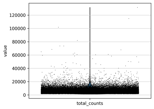
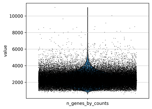
In this step we'll perform cell quality control to prevent outlier cells from influencing downstream analyses. Cells that have an unusually high transcript or gene counts are very likely to be multiplets, which is a term for two or more cells that have identical barcodes. Conversely, cells that have very low transcript or genes counts are a consequence of barcoding cells with damaged membranes, or barcoding ambient RNA.
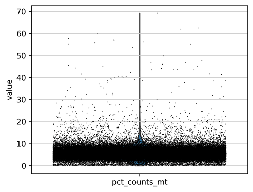
Filtering outliers can be accomplished by generating a violin plot for each cell feature and manually selecting the threshold we wish to remove cells. We'll also add another important cell feature that shows the percentage of mitochondrial genes expressed in each cell. Cells with high mitochondrial gene percentages should be removed, as they are likely to have lost cytoplasmic RNA from lysis or may have increased apoptosis (Luecken and Theis 2019).
adata.var['mt'] = adata.var_names.str.startswith('MT-')
sc.pp.calculate_qc_metrics(adata, qc_vars=['mt'], percent_top=None, log1p=False, inplace=True)

# Scanpy will prepend the string in the save argument with "violin"
# and save it to our figure directory defined in the first step.
sc.pl.violin(adata, ['n_genes_by_counts'], save='_n_genes', jitter=0.4)
sc.pl.violin(adata, ['total_counts'], save='_total_counts', jitter=0.4)
sc.pl.violin(adata, ['pct_counts_mt'], save='_mito_pct', jitter=0.4)
# Filter the data
adata = adata[adata.obs.n_genes_by_counts < 5000,:]
adata = adata[adata.obs.total_counts < 20000,:]
adata = adata[adata.obs.pct_counts_mt < 15,:]
adata.shape # Checking number of cells remaining
Lets visualize the results of our filtered data and print the updated median transcript and gene counts.
sc.pl.scatter(adata, x='total_counts', y='n_genes_by_counts', save='_gene_vs_transcript_counts')
print('median transcript count per cell: ' + str(adata.obs['tscp_count'].median(0)))
print('median gene count per cell: ' + str(adata.obs['gene_count'].median(0)))
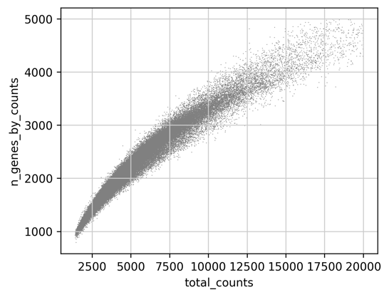
median transcript count per cell: 5302.0
median gene count per cell: 2299.0
Now that we've removed the outlier cells, we can normalize the matrix to 10,000 reads per cell and log transform the results.
sc.pp.normalize_total(adata, target_sum=1e4)
sc.pp.log1p(adata)
Identify highly-variable genes and regress out transcript counts
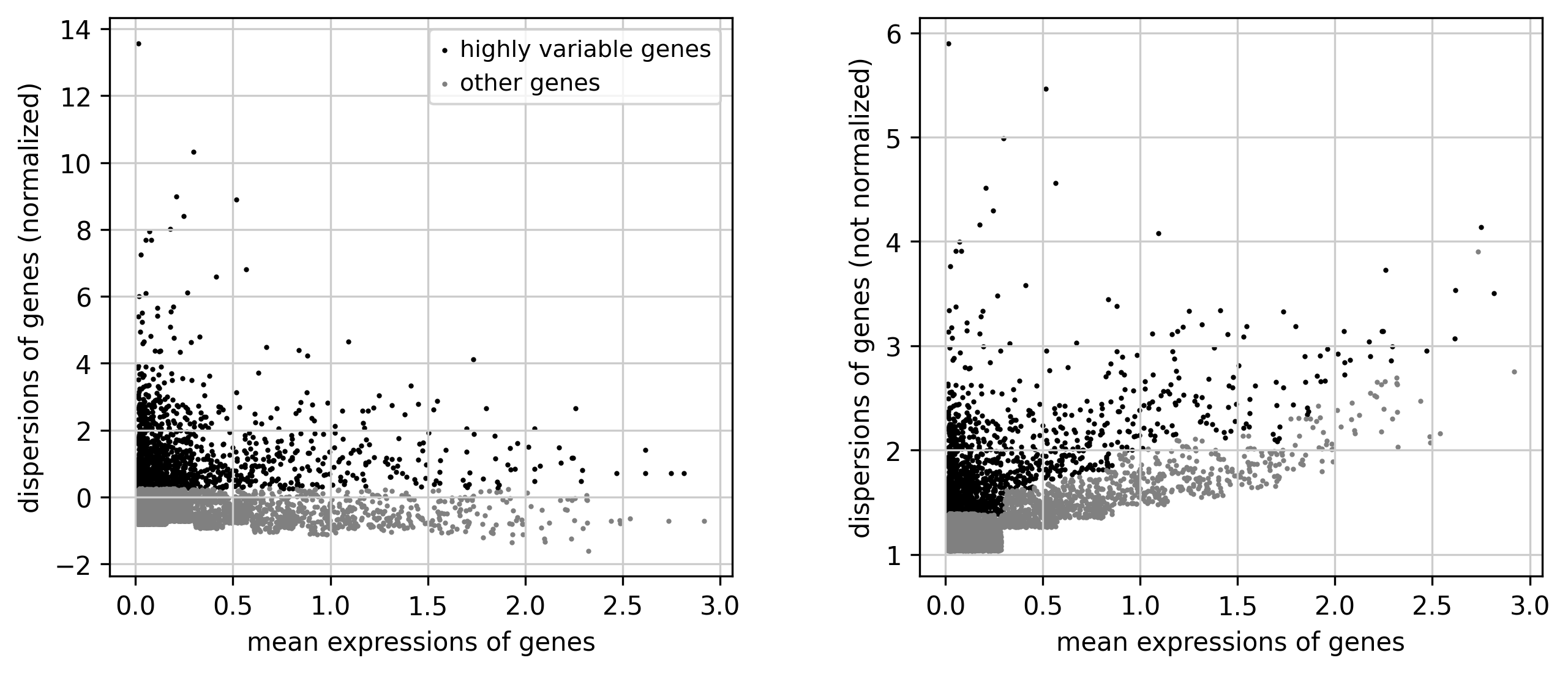
Our next goal is to identify genes with the greatest amount of variance (i.e. genes that are likely to be the most informative). This subset of genes will be used to calculate a set of principal components which will determine how our cells are classified using Leiden clustering and UMAP. You can fine tune variable gene selection by adjusting the min/max mean expression and min/max dispersion.
The regress out function is used to correct for biases in cell attributes, such as the number transcripts per cell. It's important to note that this step can merge cell populations with subtle differences in gene expression, which may or may not align with your analysis goals. You can always start a separate analysis without this feature to see which model suits your objectives.
sc.pp.highly_variable_genes(adata, min_mean=0.0125, max_mean=3, min_disp=0.25)
sc.pl.highly_variable_genes(adata, save='') # scanpy generates the filename automatically

# Save raw expression values before variable gene subset
adata.raw = adata

adata = adata[:, adata.var.highly_variable]
sc.pp.regress_out(adata, ['total_counts'])
sc.pp.scale(adata, max_value=10)
Principal component analysis
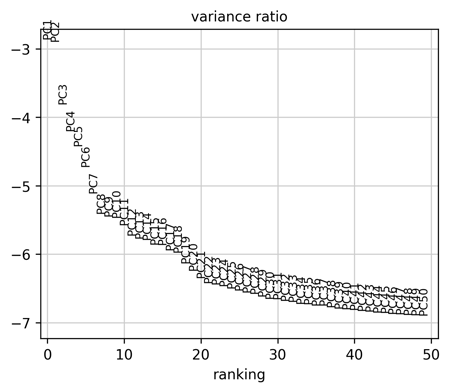
Now that we've extracted the most "informative" cells and genes from our dataset, we can start the process of dimensional reduction by generating a list of principal components (PCs). Principal component analysis will reduce the number of columns (variable gene expression values) to set of PCs which explain the variance in our dataset. Here we're using a simple and effective method for choosing the PCs by plotting the variance ratio for each PC and choosing the last PC where the ratio starts to "flatten" out. For this particular dataset we've chosen 30 PCs, which will be passed to the "sc.pp.neighbors" function in the next step.
sc.tl.pca(adata, svd_solver='arpack')
sc.pl.pca_variance_ratio(adata, log=True, n_pcs=50, save='') # scanpy generates the filename automatically
UMAP and Leiden Clustering
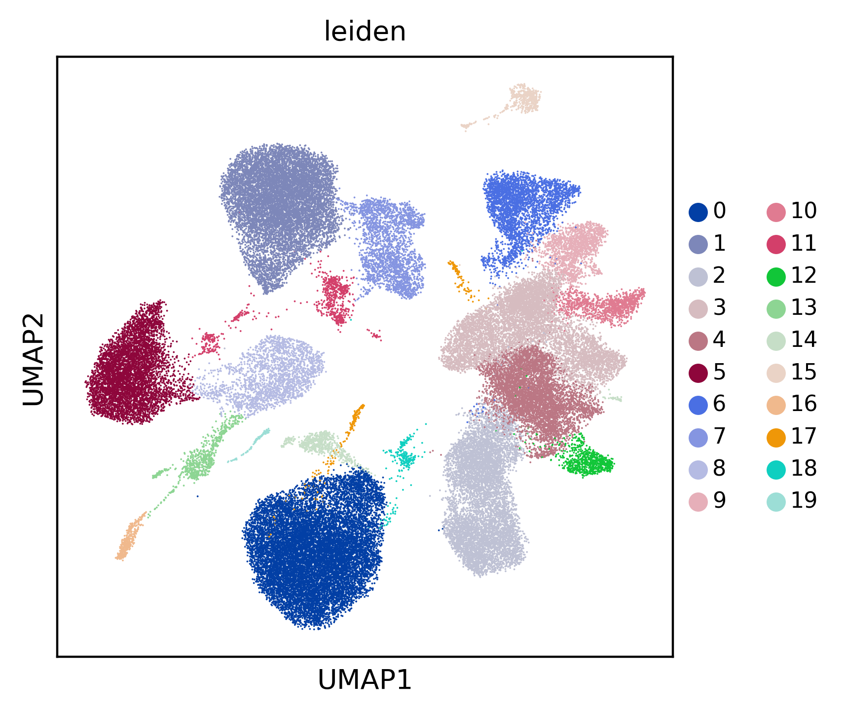
This step will involve reducing the dimensionality of our data into two dimensions using uniform manifold approximation (UMAP), allowing us to visualize our cell populations as they are binned into discrete populations using Leiden clustering. The "n_neighbors" parameter in the "sc.pp.neighbors" function will determine the size of each cell cluster; lower values will translate to a greater number of clusters by breaking up the dataset into smaller communities, and visa versa for larger values. We can also fine tune the number of clusters using the resolution parameter in the "sc.tl.leiden" function.
sc.pp.neighbors(adata, n_neighbors=10, n_pcs=30)
sc.tl.umap(adata)
sc.tl.leiden(adata, resolution=0.5)
sc.pl.umap(adata, color=['leiden'], legend_fontsize=8, save='_leiden')
Finding cluster markers
After determining the appropriate number clusters, we'll perform a statistical test to find genes enriched in each cell population. For this example we'll use the simplest and quickest method, the t-test. Scanpy provides a number of different statistical tests which can be found here.
sc.tl.rank_genes_groups(adata, 'leiden', method='t-test')

# The head function returns the top n genes per cluster
top_markers = pd.DataFrame(adata.uns['rank_genes_groups']['names']).head(5)
print(top_markers)
            0           1            2             3            4  \
0  CD247_hg38   AFF3_hg38  TCF7L2_hg38   INPP4B_hg38    IL7R_hg38
1   AOAH_hg38  BANK1_hg38   MTSS1_hg38  SERINC5_hg38    ANK3_hg38
2  SYNE1_hg38  BACH2_hg38     LYN_hg38     ANK3_hg38  INPP4B_hg38
3   GNLY_hg38   CD74_hg38  FAM49A_hg38    CAMK4_hg38  CDC14A_hg38
4  MCTP2_hg38   PAX5_hg38   DOCK5_hg38   BCL11B_hg38    RORA_hg38

             5            6           7            8             9  ...  \
0   SYNE1_hg38   PRKCH_hg38  NELL2_hg38  INPP4B_hg38    BANK1_hg38  ...
1  TGFBR3_hg38   ATXN1_hg38  PDE3B_hg38    ANK3_hg38  OSBPL10_hg38  ...
2   PRKCH_hg38    TC2N_hg38  BACH2_hg38  BCL11B_hg38     EBF1_hg38  ...
3  THEMIS_hg38  BCL11B_hg38   LEF1_hg38  CDC14A_hg38     AFF3_hg38  ...
4    ZEB2_hg38  INPP4B_hg38  CAMK4_hg38   CAMK4_hg38      BLK_hg38  ...

           17           18            19             20               21  \
0  PDE3B_hg38  TXNDC5_hg38   ATP8B4_hg38      CD74_hg38        TCF4_hg38
1  CAMK4_hg38    ELL2_hg38    NCALD_hg38       LYZ_hg38  AC023590.1_hg38
2   IL7R_hg38  MAN1A1_hg38  PPP1R9A_hg38   HLA-DoRA_hg38       EPHB1_hg38
3  PRKCH_hg38  COBLL1_hg38    NCAM1_hg38  HLA-DRB1_hg38       RUNX2_hg38
4   CD96_hg38    FUT8_hg38     RIN3_hg38    SLC8A1_hg38      CCDC50_hg38

                22           23          24            25              26
0       MKI67_hg38  TCF7L2_hg38  AUTS2_hg38     RORA_hg38  LINC01226_hg38
1       BRIP1_hg38     LYN_hg38   ETV6_hg38   SPOCK2_hg38     KCNK10_hg38
2       HELLS_hg38   MTSS1_hg38   VAV3_hg38    PLCB1_hg38       AOAH_hg38
3  AC007240.1_hg38  FAM49A_hg38   FLT3_hg38     TC2N_hg38       P3H2_hg38
4       CENPP_hg38   NEAT1_hg38    DST_hg38  PHACTR2_hg38    COL26A1_hg38

[5 rows x 27 columns]
Save/load the results
adata.write(data_path + 'adata_after_diffexp.h5ad')
adata = sc.read(data_path + 'adata_after_diffexp.h5ad')
Merging clusters and labeling cell types
A common goal of single cell RNA-seq analysis is to eventually classify all clusters into a cell "type". But what constitutes a cell type? Does a cluster represent a cell type, or a cell in a temporary state as it transitions from one type to the next? Because the appropriate number of clusters depends on the nature of the dataset and specific analysis goals, it's usually a good idea to experiment with models that vary in cluster number.
There may be situations where one can't seem to get the "right" number of clusters to build an accurate model of cell types (or cell states) in their system of interest. That is, you may have a cluster that perfectly describe cells in one population, but another population may have too many subdivisions. In the following example we'll demonstrate how to merge multiple clusters into a single unit to classify basic PBMC cell types, but it's important to note that this strategy can be used in any scenario where one wishes to customize cell classification.
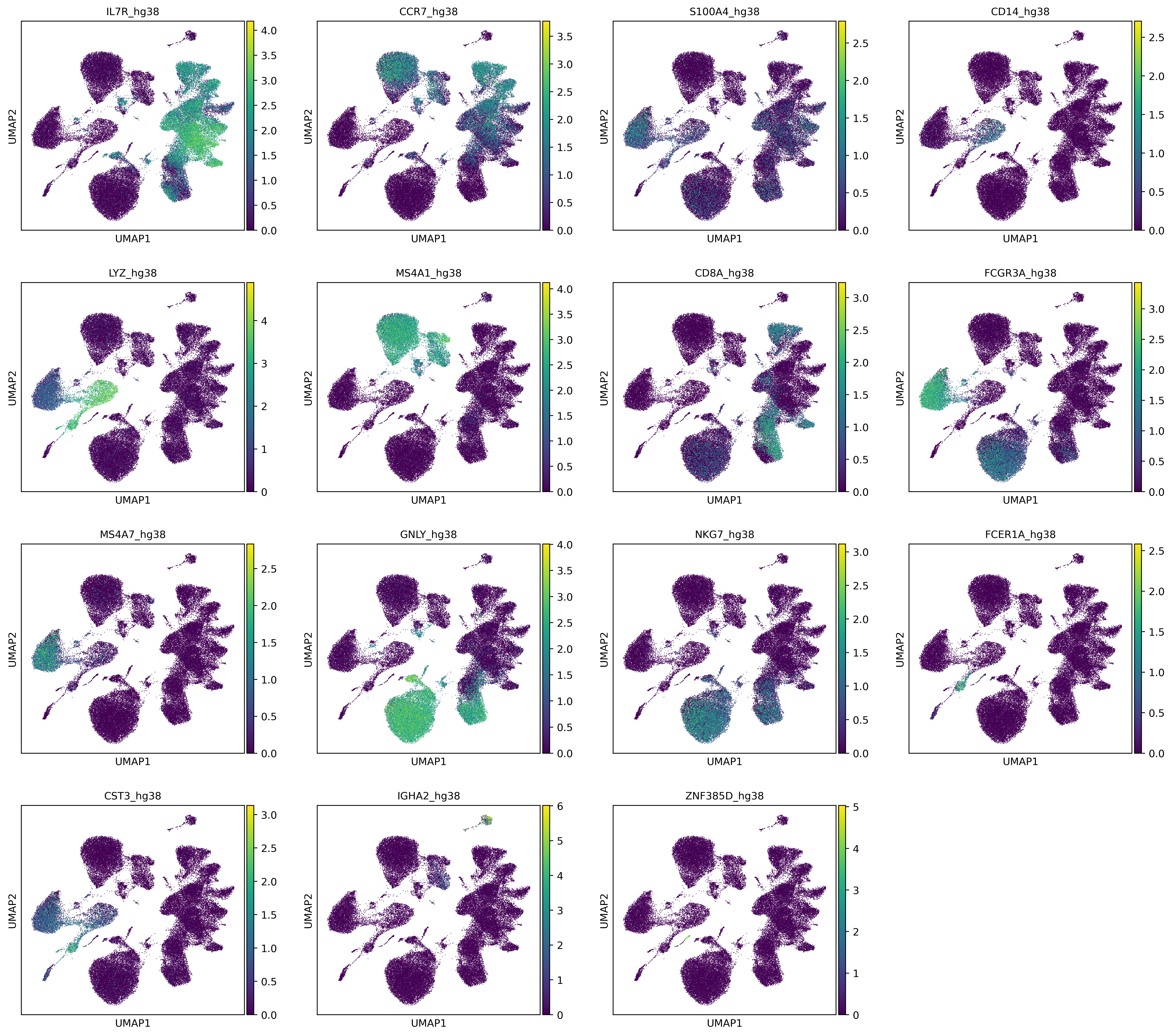
First we'll take a look at the markers from the Seurat official tutorial and see which genes correspond to cell type, and then plot each gene on a UMAP plot to see which cluster they localize with.
- Cluster ID: 0; Markers: IL7R, CCR7; Cell Types: Naive CD4+ T
- Cluster ID: 1; Markers: IL7R, S100A4; Cell Types: Memory CD4+
- Cluster ID: 2; Markers: CD14, LYZ; Cell Types: CD14+ Mono
- Cluster ID: 3; Markers: MS4A1; Cell Types: B
- Cluster ID: 4; Markers: CD8A; Cell Types: CD8+ T
- Cluster ID: 5; Markers: FCGR3A, MS4A7; Cell Types: FCGR3A+ Mono
- Cluster ID: 6; Markers: GNLY, NKG7; Cell Types: NK
- Cluster ID: 7; Markers: FCER1A, CST3; Cell Types: DC
- Cluster ID: 8; Markers: PPBP; Cell Types: Platelet
Note that the platelet marker PPBP isn't present in this dataset. We also have a couple unclassified clusters that aren't present in the official tutorial. We'll name these two clusters after their top marker genes, IGHA2 and ZNF385D.
gene_list = ['IL7R', 'CCR7', 'S100A4', 'CD14', 'LYZ', 'MS4A1', 'CD8A',
    'FCGR3A', 'MS4A7', 'GNLY', 'NKG7', 'FCER1A', 'CST3', 'IGHA2', 'ZNF385D']

sc.pl.umap(adata, color=[i + '_hg38' for i in gene_list], color_map='viridis', legend_fontsize=8, save='_PBMC_markers')
Next, lets generate a UMAP plot with the clusters explicitly labeled so it's a easier to see which cluster corresponds with our PBMC markers.
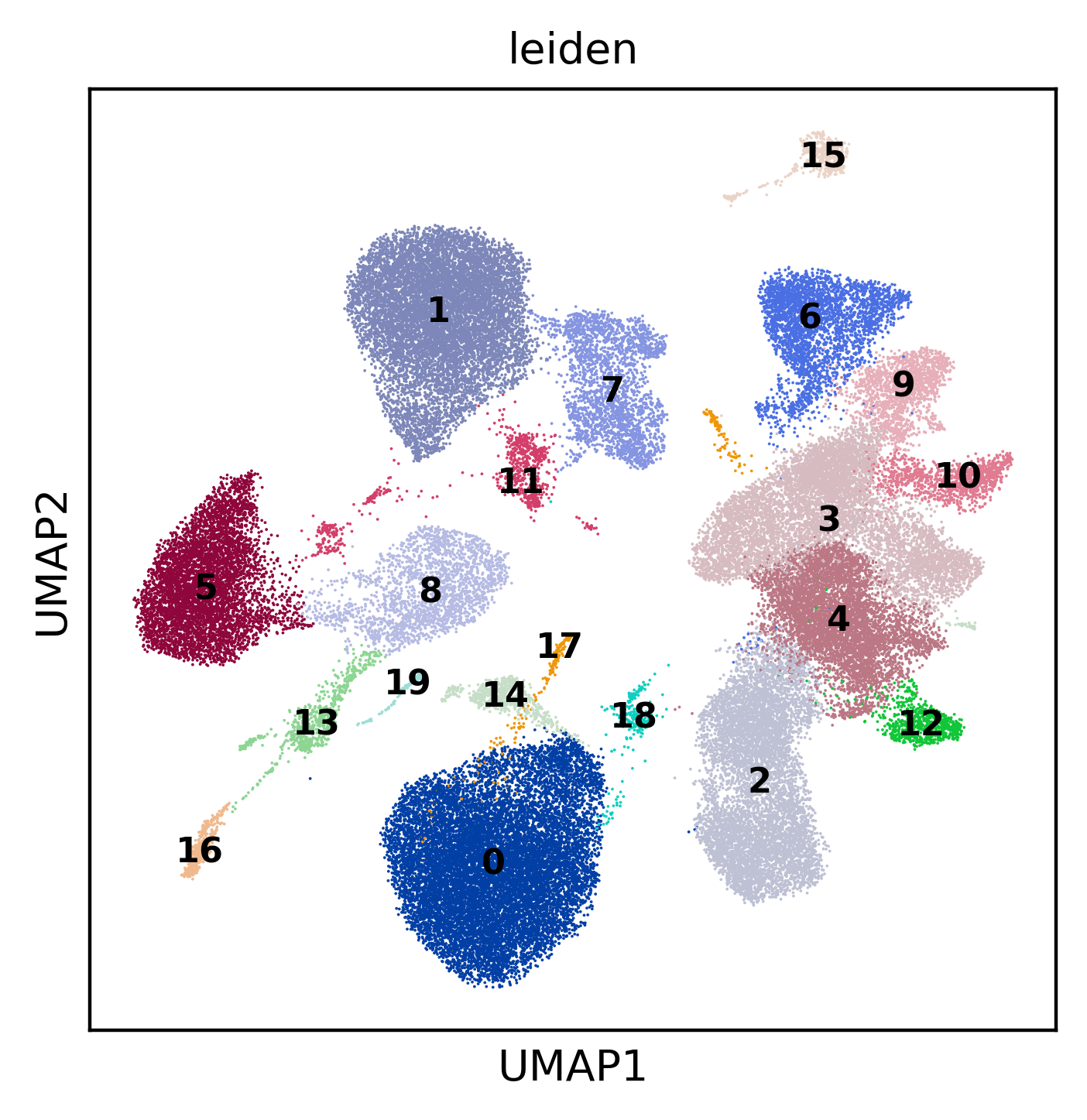
The last step involves generating a dictionary where each cell type is assigned multiple clusters so they can be merged.
# Fill in the clusters that belong to each cell type based on each marker in the plot above
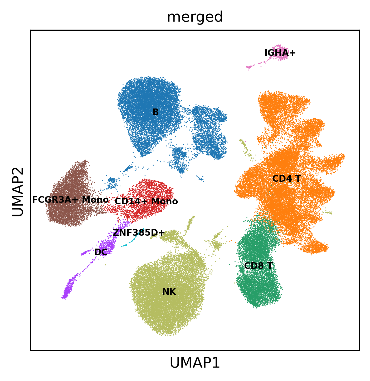
cell_dict = {'CD4 T': ['3','4','6','9','10','12'], 'CD14+ Mono': ['8'], 'B': ['1','7','11'], 'CD8 T': ['2'],
    'FCGR3A+ Mono': ['5'], 'NK': ['0','14','17','18'], 'DC': ['13','16'], 'IGHA+': ['15'], 'ZNF385D+': ['19']}

# Initialize empty column in cell metadata
adata.obs['merged'] = np.nan

# Generate new assignments
for i in cell_dict.keys():
    ind = pd.Series(adata.obs.leiden).isin(cell_dict[i])
    adata.obs.loc[ind,'merged'] = i

sc.pl.umap(adata, color=['merged'], legend_loc='on data', legend_fontsize=6, save='_merged_new_lbl')
Our final UMAP with cell names.
Analysis and visualization of data generated from Parse Biosciences EvercodeTM WT technology can be performed using TrailmakerTM or using code-based methods such as Seurat or Scanpy. Trailmaker is a user-friendly platform that incorporates both Seurat and Scanpy options, and covers all essential steps in the data analysis process. For more information on Trailmaker, visit our website or sign up to start exploring - it’s free to all Parse customers and all academic users.