Gene expression
Continuous Embedding
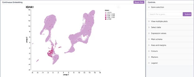
The continuous embedding plot allows you to see the expression of a particular gene.
Gene selection
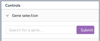
Type the gene name in the search box to select a gene of interest. You can find the search box under the Gene selection control.
Select data
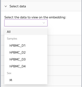
You can also select the data to view on the embedding. For example, you can choose to see the gene expression in cells from a specific sample. To do this, use the Select data control.
Expression values
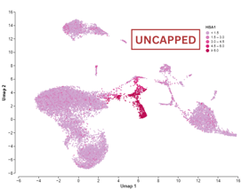
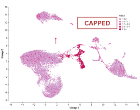
You can choose to have capped or uncapped values under the “Expression values” control, where the default is set to capped Capped values for the expression level of a gene in a given cell refer to genes that are expressed at a level above a predetermined threshold, determined by the 95th percentile. These genes are said to be capped because their expression values are artificially set to this threshold, even though their true expression level may be higher.
Whereas uncapped values refer to genes that are reported as their actual expression value.
Capping can be done to manage the potential high variability often found in scRNA-seq data. By capping the expression values at this threshold, one can mitigate the impact of extremely high outliers which may not be biologically relevant but rather artefacts or noise. However, a limitation of this approach is that it could potentially result in the loss of meaningful information about genes that are naturally expressed at extremely high levels or in specific cellular conditions.
Heatmap
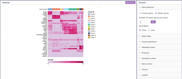
The heatmap shows marker genes for the Leiden or Louvain clusters by default. You can choose to see custom genes or marker genes in the heatmap.
Gene selection
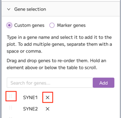
By default, three marker genes per cluster are shown. To view custom genes on the Heatmap, select the “custom genes” option, type in a gene name and select it to add it to the plot. You will see automatic suggestions for the genes when you are typing out the gene name. Click on the gene in the suggestion box to add the gene, or click on the Add button.
To add multiple genes, separate them with a space or comma. Gene lists can be pasted into the gene search box from the Data Exploration module or from a document or spreadsheet.
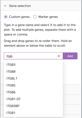
The genes can be reordered on the y-axis of the heatmap by dragging and dropping the dots next to the gene name. To deselect a gene click on the X on the right of the gene name.
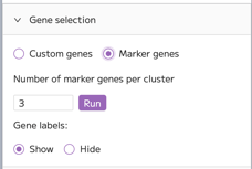
To see the expression of marker genes, click on the “Marker genes” option. Type the number of marker genes per cluster that you want to plot, and click “Run”. You can also choose to show or hide gene labels in this menu.
Metadata tracks
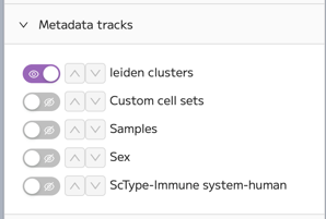
To add metadata tracks, click on the Metadata tracks control. Toggle the eye icon to add a metadata track to the heatmap. The toggled selections appear as colored tracks above the heatmap.
To change the order of metadata tracks or Louvain cluster tracks in the heatmap, click on the arrow icon to move the track up or down in the plot. The item on top of the list will also be shown at the top of the heatmap block. Note that this doesn’t reorder the default ordering of cells as it’s still grouped by Louvain clusters. Cells can be reordered within the heatmap using the ‘Group by’ control (see the next section).
Group by
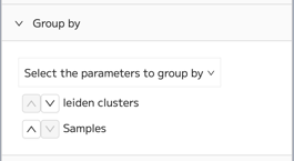
To reorder the cell ordering in the heatmap, click on the ‘Group by’ control. In the popup, hover over the ‘Select the parameters to group by’ drop-down menu. Click + to add a parameter you want to order cells by. To exclude the parameter, click - on the left of the parameter. Then click on the up arrow to change the ordering of the cells. The parameter on the top of the list will be used as a grouping parameter.
Expression values
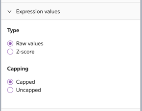
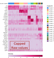
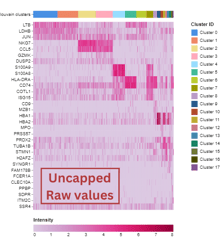
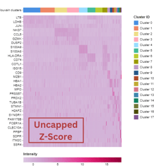
You can change the type and capping of the expression values under the Expression values control. You can choose to use raw values or Z-scores. You can also choose to have capped or uncapped values. Capped values for the expression level of a gene in a given cell refer to genes that are expressed at a level below a predetermined threshold, typically set to be the detection limit of the scRNA-seq experiment. These genes are said to be capped because their expression values are artificially set to this threshold, even though their true expression level may be lower. Whereas uncapped values refer to genes that are reported as their actual expression value.
Violin Plot
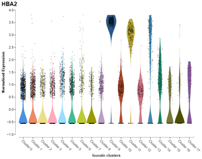
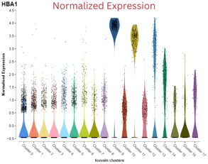
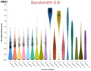
The violin plot allows you to look at the distribution of normalized expression of a gene of interest across Leiden or Louvain clusters by default. The black dots represent cells.
Sometimes you can see black horizontal lines at the bottom of kernels. These are points that signify the cells where the gene is not expressed, and visually can look like a line on the plot.
Gene selection
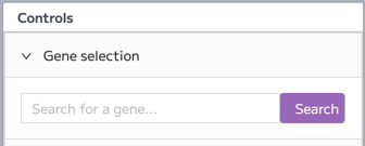
Under the Gene selection control, you can select your gene of interest. Type the gene into the search box. You will see automatic suggestions of the gene when you are typing out the gene name. You can click on the suggested gene to autocomplete the gene name. Click search to plot the violin plot.
View multiple plots
You can view multiple violin plots for the expression of different genes in a grid view in one window.
Type the gene name into the search box to plot multiple violin plots. You will see automatic suggestions of the gene when you are typing out the gene name. You can click on the suggested gene to autocomplete the gene name. To add multiple genes, separate them with a space or comma. Click add to plot the expression of your selected genes. The selected genes are going to appear at the bottom of the controls menu.
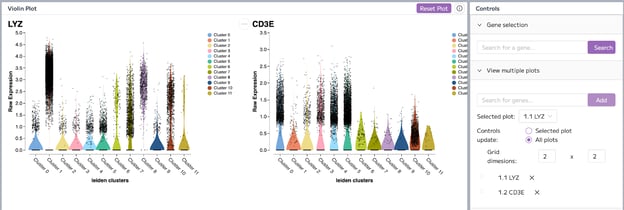
Drag and drop the genes in the gene list to rearrange the order of plots in the grid. To deselect a gene and remove a plot from the grid, click on the X on the right of the gene name.
You can also change the dimensions of the grid. The grid dimensions are represented as Rows x Columns. For example, to view four plots you could choose a 1x4 grid or a 2x2 grid.
You can also find the options to select a specific plot and update the controls. If you have selected “Controls update: All plots”, then changes in other controls such as Select data and Data transformation are going to be applied to all the plots in the grid.
If you select a plot and choose “Controls update: Selected plot”, changes in controls are going to be applied only to the selected plot.
Note that each plot needs to be saved individually - it is not possible to save the multiple plot view as a single image file.
Select data
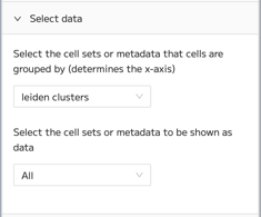
You can change the metadata and cell sets used for this plot using the first dropdown menu in the select data control. The selection in the first dropdown menu controls the x-axis of the plot
In the second dropdown menu in the select data controls, you can change the cell set or metadata to be used as data. The default option is to show ‘All’. However, you can choose to display only a part of the data such as an individual sample or metadata group.
Data transformation
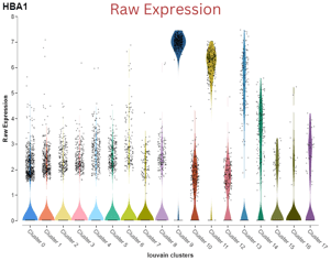
Under the Data transformation control, you can change the type of gene expression values from normalized to raw values. Note the change in the values on the y-axis in the screenshots below.
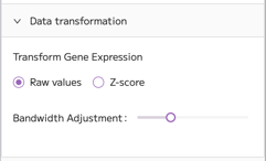
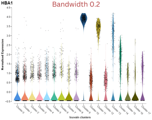
You can also adjust the bandwidth, which impacts the density fit of the kernels. To change the bandwidth, move the slider to your preferred value. Values range from 0 to 1 in 0.05 intervals.
Dot Plot
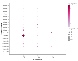
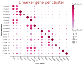
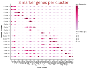
In Trailmaker, the dot plot shows the percentage of cells expressing the genes of your choice. The percentage of gene expression in all the cells of a specific cluster is represented by the size of the dot. The smaller the dot, the smaller the percentage expression. If you see a bigger dot in a specific cluster, the gene is more expressed there. The color reflects the level of expression of the gene.
In Seurat projects, the DotPlot function from the Seurat R package is used, which calculates the average expression of each gene across a specific cluster or group of cells. This average is computed using scaled data, meaning the expression values are standardized to have a mean of 0 and a standard deviation of 1. As a result, the “Average Expression” values depend on the subset of cells or datasets that have been selected for comparison. Also note that scaling is automatically disabled when only two groups are present, to avoid misleading results, as discussed here.
By default, three genes with the highest dispersion across all cells are shown.
Gene selection
You can look at the expression of custom genes of your choice or marker genes.
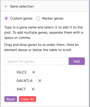
To select custom genes, type in a gene name in the gene search box. You will see automatic suggestions for the genes when you are typing out the gene name. To add multiple genes, separate them with a space or comma. Gene lists can be pasted in from the Data Exploration module or from a list in a document or spreadsheet. Click Add to apply to plot your selected gene/s. The gene/s you have selected will appear below the search bar.
To rearrange the order of the genes on the x-axis, drag and drop these genes in the gene list below the search box. To deselect a gene click on the X on the right of the gene name.
To see the expression of marker genes, click on the “Marker genes” option. Type the number of marker genes per cluster that you want to plot. Click Run to plot the marker gene dot plot.
Select data
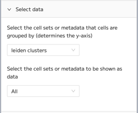
In the dot plot, you can also change the cell sets or metadata that cells are grouped by, using the first dropdown menu in the “select data” controls which determines the y-axis.
You can also select the cell sets or metadata to be shown as data. For example, the cells can be grouped by Louvain clusters (y-axis), and you can select to view data only from one sample using the second dropdown menu in the select data controls.
Size scale
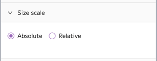
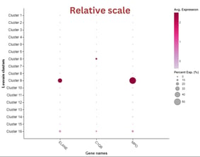
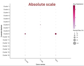
You can change the size scale of the dot plot. There are two available options - relative and absolute scale. Absolute scale will show total expression, while relative scale will be relative to what you select in the "Select data" control. So, if you select Louvain clusters, the size scale will be relative to all clusters, but if you select samples, the size scale will be relative to all samples.
Normalized expression matrix
In the Plots and Tables module, you can download the normalized expression matrix for specific samples, metadata groups, clusters, and custom cell sets. The normalized expression matrix contains genes as rows and cells in columns, where for each gene you have a normalized expression value for each cell. The normalized values allow us to see biological variability more clearly. The Seurat object is subsetted before exporting the matrix.
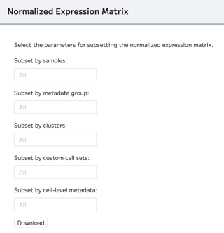
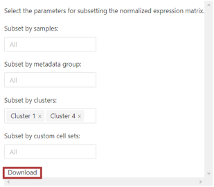
To export the full normalized expression matrix, just click download. The matrix is going to be exported as CSV.
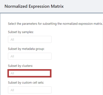
To subset the matrix, click on the “All” box below the parameter. Note that you can also subset using multiple parameters. For example, let's subset the normalized expression matrix based on clusters.
Click on the cluster(s) you want to subset the matrix by. You can choose multiple clusters, and the selected cluster(s) will appear in the box. To deselect a cluster, click on X.
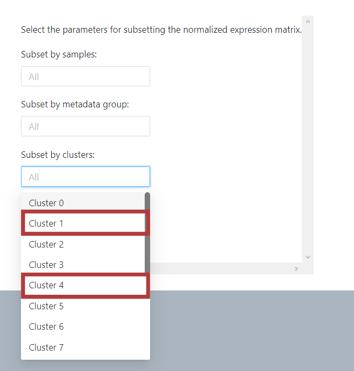
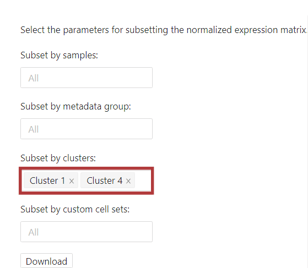
When you have selected your preferred parameters, click download.