
Plots and Tables
Overview
The Plots and Tables module of Trailmaker provides a wide range of pre-loaded data visualization options to quickly and easily get insights from your data. It also allows users to customize the plots and export them in a variety of formats.
The module is organized into three sections to make finding the right plot easy and intuitive. The Cell sets & metadata section contains plots that graphically represent cell set properties - categorical embedding, frequency plot, and a trajectory plot. The Gene expression section contains plots that represent the expression of individual genes across cell sets, such as violin plots, dot plots, and more. The Differential expression section includes a volcano plot that visually represents differences between and within groups.
See also: Guided walkthrough: Insights Plots and Tables
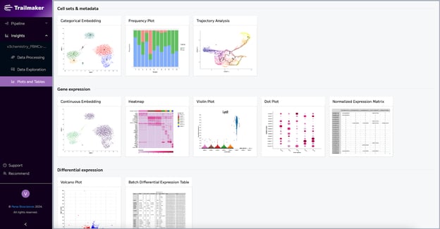
General options
All the plots have general customization options!
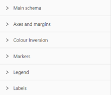
Main schema
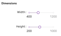
Under the main schema control, you can change the dimensions of the plot - customize the plot’s height and width using the slider scale.
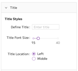
In the title menu, you can define the plot's title, change the title's font size, and indicate the location of the title.
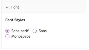
In the font menu, you can change the text font in the plot from Sans Serif to Sans or Monospace.
Axes and margins
Under the Axes and margins control, you can customize the y-axis and x-axis. You can also customize the margins and grid lines.
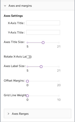
- You can change the titles of the x- and y-axis, as well as the size of the axis titles, using the slider. Just slide the dot to your preferred value. The changes to axes titles will be applied to the plot automatically.
- You can also rotate the labels on the x-axis. To do this, toggle the “Rotate X-Axis Labels” button.
- You can change the size of axes labels using a slider scale. Just slide the dot to your preferred value.
- To change the margins in the plot, use the slider scale to change the margins from 0 to your preferred value. This will move the plot off-center by offsetting automatic margins.
- To add grid lines to the plot, use the slider scale to change the grid line weight from 0 to your preferred value.
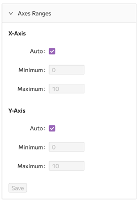
In this menu, you can also override the automatic axes ranges. To manually input values for axes ranges, deselect the Auto control under X-axis and/or Y-axis. Then input your preferred minimum and maximum values, and click Save.
Expression values
Some plots including the Violin plot and Heatmap include an "Expression values" menu where users can choose between "raw values" and "z-score".
In these cases, "raw values" are not referring to raw counts directly obtained from the single-cell RNA sequencing experiment, but instead to the normalized expression values. LogNormalize values are used for all projects, regardless of the normalization option selected in the Data Processing module.
The alternative data display option is "z-score". Z-scores provide a measure of how many standard deviations a particular data point is from the mean expression level of that gene across all cells in the dataset. The calculation of Z-scores is performed on the normalized expression values (the "raw values” in this context). For each gene, a z-score transformation is applied such that the resulting values have a mean of 0 and a standard deviation of 1 across all cells. This allows for the comparison of expression of each gene within its own distribution.
Color inversion
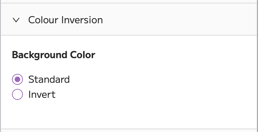
The Colour inversion control allows inverting the color of the background. If the standard color of the plot's background is white, this control enables you to turn the background black.
Markers
This menu applies to embedding and volcano plots. Here, you can change the style and shape of markers.
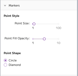
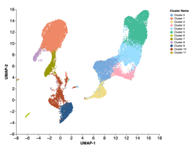
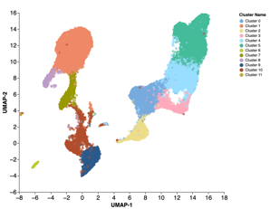
The point (marker dot) size can be changed from 1 to 100 using a slider scale. Examples of small point size of 1 and large point size of 10 are shown below on the left and right, respectively.
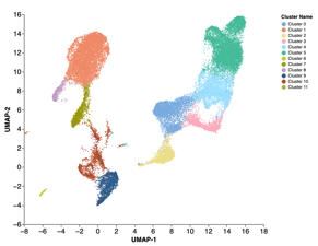
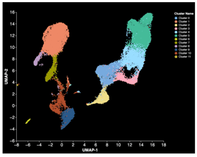
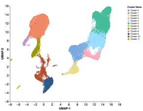
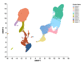
Point opacity can also be changed using a slider scale for the embeddings. The default opacity is at 5, but it can be customized on a scale from 1 to 10. The examples below show opacity settings of 1 (left) and 10 (right).
There are two options for point shape - diamond and round. To change the shape, select your preferred point shape.
Legend
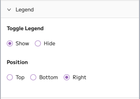
Under Legend control, you can decide whether to show or hide the plot legend. To hide the legend, toggle the Hide option. You can also choose the position of the legend by clicking Top, Bottom, or Right.
Labels
The Categorical embedding plot and Trajectory analysis plot have the "Labels" option.
The label control can be used to show or hide the cell set labels on the main plot.
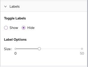
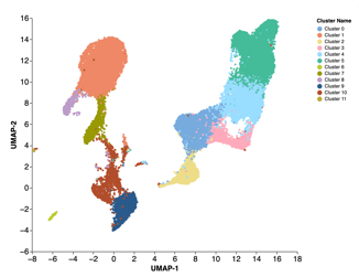
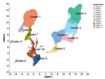
You can also change the size of the labels if you choose to show them on the plot. This might be particularly helpful if you have a lot of clusters in the embedding and their names overlap. To change the size, use the size slider to choose your preferred value.
Overlapping labels can be re-spaced to prevent the overlap using the "Repel" slider.
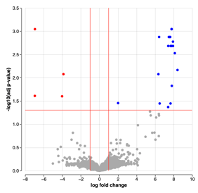
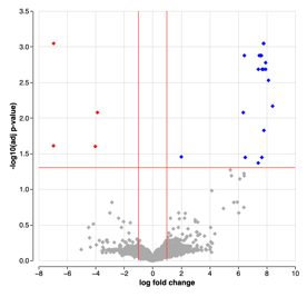
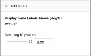
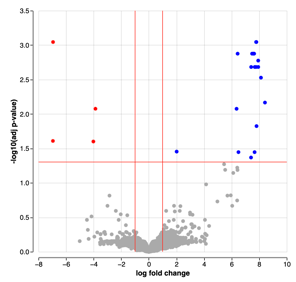
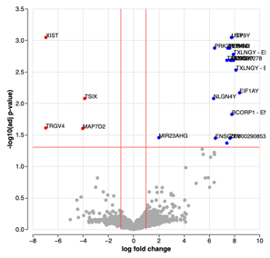
Additionally, in the volcano plot, you can find a control called "Add labels", which are the gene names. This option allows specifying the negative log10 of the adjusted p-value. Above your chosen values, labels (names) for upregulated and downregulated genes will be displayed.
Reset plots
All the plots have a reset button that appears after you make any changes to the default plot.
Click the blue reset button on top of the plot to return to the default plot and undo all changes.
Cell sets & metadata
Categorical Embedding
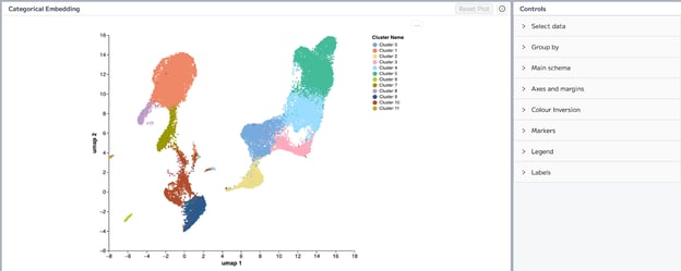
The default categorical embedding plot shows a UMAP embedding of cells from all samples clustered and colored according to the Louvain clustering algorithm. You can read more about how this plot is generated in Step 7: Configure embedding section.
Categorical embedding allows the coloring of the UMAP according to categorical variables. These variables are discrete and used to split data based on specific characteristics, such as samples. The default embedding plot displays Louvain clusters.
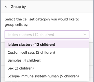
Group by
You can use the Group by control to change the cell set category by which you would like to group cells.
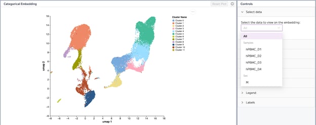
Select data
Using Select data control, you can select a sample of interest. This will result in the embedding only showing cells from the selected sample instead of all samples.
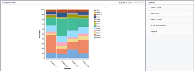
Frequency Plot
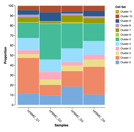
A frequency plot shows the distributional information of a variable. Simply, it summarizes the data by plotting how frequently a specific value occurs. In Trailmaker, the default frequency plot shows the proportions of cells from each cluster in every sample. So, the y-axis represents the proportions, which are frequency values. While the x-axis represents samples by which the cells are grouped. You can use a frequency plot to see if there is a significant shift in the proportions of cells between samples.
Select data
You can change the metadata and cell sets used for this plot using select data control. Using the first drop-down menu, you can specify whether sample or metadata groups are presented on the x-axis. Using the second drop-down menu, you can select the data that are presented on the plot, such as the default Leiden or Louvain clusters, custom cell sets or scType annotations.
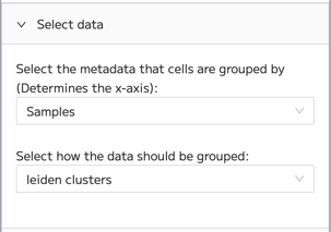
Note that depending on the set-up of your custom cell sets, it may not be appropriate to visualize custom cell sets in a frequency plot. For example, in cases where individual cells belong to multiple custom cell sets or in cases where not all cells are assigned to a custom cell set, you should carefully consider whether a frequency plot, particularly showing proportion, is appropriate.
Plot type
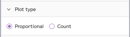
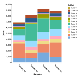
You can change the plot type to a frequency plot of absolute counts. To do this, use the Plot type control and click on Count. Absolute counts reflect the number of cells in that cluster in a sample, while proportions reflect the proportion of cells in the cluster compared to all other clusters.
Trajectory Analysis
Trajectory analysis allows the user to determine a pattern of a dynamic biological process experienced by cells - a "trajectory" of gene expression changes. Then the cells are arranged according to their progression through that process, which means they are placed at their proper position in the trajectory. This progression can be quantitatively measured using pseudotime. Pseudotime has been defined as “an abstract unit of progress: simply the distance between a cell and the start of the trajectory, measured along the shortest path.” [1].
The method used to perform Trajectory analysis in Trailmaker is dependent on the type of project:
- For Seurat projects, trajectory analysis is calculated using the Monocle3 method.
- For Scanpy projects, trajectory analysis is calculated using the Partition-based graph abstraction (PAGA) method. In PAGA, when nodes are disconnected from the trajectory, their pseudotime value is calculated as infinite. In Trailmaker those nodes are displayed with the maximum pseudotime value in the analysis.
Calculate root nodes
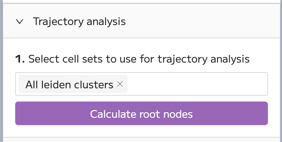
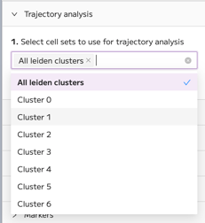
To get started, select cell sets to use for trajectory analysis. By default, all Louvain clusters are included. However, you can choose to perform trajectory analysis for specific clusters, samples, or metadata. Click on the box above “Calculate root nodes”, and a drop-down menu will appear with all the cell sets in your dataset. Once you’ve made your selection, click “Calculate root nodes”.
Select root nodes
After the calculation is done, select root nodes by clicking on the white points. The root nodes signify where you want the trajectory to start. You can select multiple nodes at once by drawing a selection. Hold down the Shift key to do this, and then click and drag. Nodes inside the selection will be added as root nodes and appear in red.
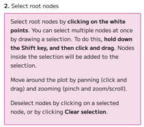
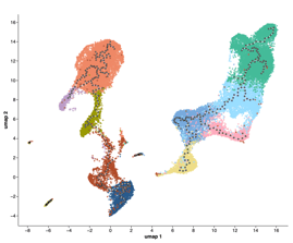
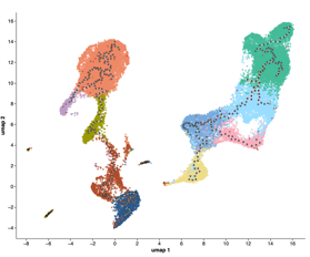
Deselect nodes by clicking on a selected node or by clicking Clear selection.
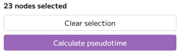
When you have made your selection, click “Calculate pseudotime”. The trajectory plot will be colored by pseudotime. Move around the plot by panning (click and drag) and zooming (pinch and zoom/scroll).
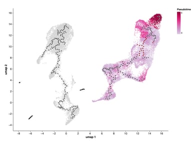
If you have made changes to your selection (e.g., cleared the selection or added new nodes to the selection) after clicking calculate, you can recalculate the pseudotime.
Check out the “How to reproduce a published trajectory analysis plot with Trailmaker" for a guided walkthrough the trajectory analysis plot using a Seurat project.
Display
Under the display control, you can change plot values from pseudotime to cell sets. Before selecting root nodes and calculating pseudotime, the default plot values will be based on cell sets. After calculating pseudotime, the default plot will show pseudotime.
You can hide the starting nodes (white points) from the plot using the Show/Hide Trajectory controls.
