
Data Processing steps
Step 1: Classifier filter
The classifier filter aims to exclude background and retain cells. To achieve this, the filter uses the ‘emptyDrops’ method to calculate the False Discovery Rate (FDR), a statistical value which represents the probability that a droplet is empty (read more about this method here). The default FDR value is 0.01 for all samples. Only data points with FDR < 0.01 are retained. Therefore, in this step, barcodes with low FDR are retained for downstream analysis, whilst barcodes with a high FDR are removed from downstream analysis.
Note that step 1, classifier filter, is not needed for Parse Biosciences data, as the emptyDrops method is only needed for droplet based technologies. You can choose to enable this filter using the Enable button at the top of the page. For 10x Chromium and BD Rhapsody data, this filter is enabled by default. Note that for datasets that have been pre-filtered (e.g. 10x Chromium data that has been filtered in Cell Ranger) the Classifier filter is disabled.
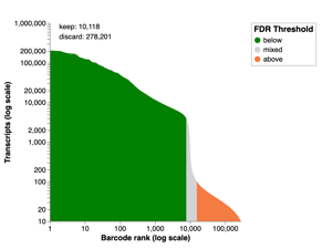
Two plots are provided to visualize the data in the classifier filter. The first plot is a knee plot that determines the FDR threshold for considering cells valid for analysis. The knee plot ranks cells by the number of distinct transcripts for each barcode on a logarithmic scale. Using the log value of the transcripts exposes a “knee” on the graph curve where the number of transcripts decreases. The turning point in the “knee” is usually used as the point to set the FDR threshold. Cells with low transcript counts contain fewer transcripts, and there is a higher probability that the cells are background or empty droplets. Therefore we would like to filter cells that are above the FDR threshold (orange) out. The cells in the green region have an FDR<0.01 and are retained. The gray “mixed” region contains some cells that are retained and some cells that are filtered out.
The second plot is an “empty drops plot”. This is an alternative visualization of the data which plots the number of transcripts against the probability that the cell is a real data point or background. The red line shows the threshold value that is set to filter the cells. Cells below this red line are retained, while cells above the red line are excluded from downstream analysis.
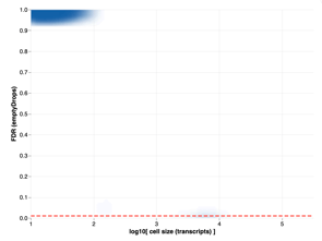
The default FDR value is set to 0.01 in this filtering step. This is the standard threshold used for the emptyDrops method. Although it is possible to override this filter threshold, we do not recommend that you do so.
Step 2: Cell size distribution filter
The cell size distribution filter can be used to fine-tune the classifier filter, by further discarding background from your dataset. For Parse Biosciences data, this is the main filter that is used to exclude background. For other data types (including 10x Chromium and BD Rhapsody), this filter is disabled by default though you can choose to enable it. You will then need to re-run Data Processing in order to apply the changes.
Unlike the classifier filter which works on probability, this filter sets a hard threshold on the minimum number of transcripts. Cells with transcript counts lower than this threshold are filtered out.
The data for this filter is visualized as a knee plot. The plot ranks cells according to the number of transcripts on a logarithmic scale. The inflection point around the “knee” signifies the threshold at which the number of transcripts in a cell changes drastically. Note that the cell rank on the x-axis is on a logarithmic scale, which means the area under the curve does not proportionally represent the number of cells that are filtered / unfiltered.
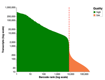
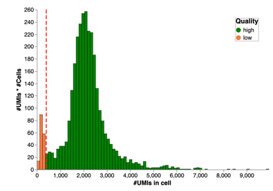
The second plot view in this filter is a histogram that shows the number of cells that are affected by the cell size distribution filter. This histogram visualizes cells below (orange) and above (green) the set threshold. The orange cells are filtered out of the dataset whereas the green cells are retained. If the histogram plot shows a binomial distribution then consider switching on this filter. For example, in the histogram plot below the cells identified in orange may in fact be background and you should consider filtering them out.
Step 3: Mitochondrial content filter
Cells may be alive, dead or dying. The mitochondria of dead and dying cells rupture, spilling out transcripts of mitochondrial genes into the cell. The presence of these mitochondrial gene sequences can skew the analysis results, as transcripts from live cells are often of interest rather than transcripts of dead cells. Thus, for most datasets it is advisable to filter out dead cells from the analysis.
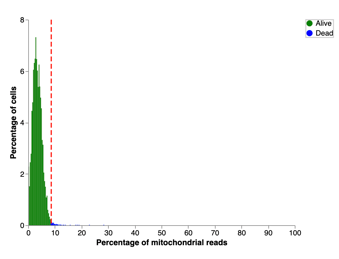
The mitochondrial content filter removes dead and dying cells by looking at the percentage of mitochondrial transcripts and setting an appropriate threshold. Cells with mitochondrial content higher than the threshold are removed from downstream analysis.
The default threshold for the proportion of mitochondrial genes is calculated per sample. The typical cut-off range is 5-30% of mitochondrial reads per cell. The default cut-off in Trailmaker is determined as the median plus 3 median absolute deviations, or the median plus 0.5 percentage points, whichever is higher (calculated on a per sample basis).
Two plot views are available in this filter. The first plot is a histogram which shows percentages of mitochondrial reads and their corresponding proportions of cells. The percentage of mitochondrial reads is the percentage of transcripts mapped to mitochondrial genes from total number of transcripts. Dead cells (blue) are filtered out and live cells (green) are retained.
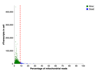
The second plot is a scatter plot which shows the total number of transcripts in each cell plotted against the percentage of mitochondrial reads. Each dot in this plot is an individual cell. As in the previous plot, the dead cells are filtered out (blue) and live cells (green) are retained.
Step 4: Number of genes vs transcripts filter
The number of genes vs transcripts filter works on the principle that the number of unique transcripts increases with the number of genes. Outliers typically fall into one of two categories:
(1) Cells contain a lot of genes but few transcripts. This means transcripts are not amplified well.
(2) Cells contain few genes but a lot of transcripts. This means that the few transcripts that exist are over-amplified.
This filter visualizes the data using a scatter plot to map the number of gene counts on a logarithmic scale against the number of transcripts on a logarithmic scale. The range of acceptable data points is defined with 2 thresholds, signified by red lines. Cells not located between the two red lines are considered outliers and are filtered out.
For Parse data, a third order spline (a cubic polynomial) model `splines::bs` is applied to the data by default ('spline' option in the menu controls), whereas for other technology types a linear fit model `MASS::rlm` is applied by default.
The ‘prediction interval’ (R function predict) is the stringency for defining outliers: it sets the prediction intervals calculated by the R `predict` where `level = prediction interval`. Prediction intervals represent the likelihood that the predicted value will be between the upper and lower limits of the prediction interval. Prediction intervals are similar to confidence intervals, but on top of the sampling uncertainty, they also express uncertainty around a single value. They must account for the uncertainty in estimating the population mean, plus the random variation of the individual values. Higher prediction interval means higher probability of the value to be inside the range. Consequently, the size of the interval will be wider. The higher the prediction level, the less stringent we are when filtering the cells. Conversely, the lower the prediction level, the more stringent we are, and we exclude more cells that are far from the behaviour of the relationship between the number of genes and the number of transcripts.
The scatter plot is interactive - moving the red prediction interval lines will help you to choose the most appropriate value to filter cells in your samples. To do so override the automatic settings as shown in Adjusting a data processing setting section, and use the prediction interval slider to choose your preferred values.
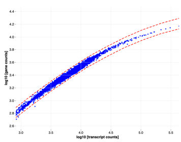
If one or more samples in your dataset contains a separate population of cells in this filter plot, such as in the example plot above, then we recommend further investigating the population to determine if it should be excluded or retained. One way to do this is to disable the filter (using the ‘Disable’ button at the top of the page) which will retain all cells for downstream analysis, and allow you to further investigate the secondary population in downstream modules in Trailmaker.
Step 5: Doublet filter
Doublets contain the content of multiple cells which can lead to skewed data and false conclusions, especially concerning cellular heterogeneity and identity. There are several reasons for doublet occurrence, which can vary according to the technology type.
The doublet filter calculates the doublet probability for all cells and filters out cells with a high probability of being a doublet. Calculation of the probability is carried out using the scDblFinder algorithm (a detailed explanation of this method can be found here).
The doublet score calculation incorporates the expected doublet rate. Trailmaker uses the following expected doublet rate values for Parse Biosciences samples: 0.046 for WT Mini, TCR Mini and BCR Mini kits; 0.034 for WT, TCR and BCR kits; 0.064 for WT Mega, WT Mega 384, TCR Mega and BCR Mega kits. For 10x Chromium samples in Trailmaker, the doublet filter uses the default scDblFinder expected doublet rate of 1% per 1000 cell captures.
This filter sets a hard threshold above which cells are filtered out. This threshold is marked by the red line in the provided plot for this filter. The plot shows the proportions of cells and their corresponding probabilities of being doublets.
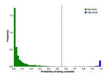
For samples that contain few cells, the calculation of doublet score probabilities has less power and, therefore, tends to show more cells with an intermediate score between 0.2 and 0.8. Care should be taken to check the doublet filter threshold for samples with few cells.
Step 6: Data integration
The Data Integration step removes batch effects and reduces the dimensionality of the data.
Batch effects are variations caused by differences in experimental conditions, introducing noise which skews the true variation for a sample. Runs of different samples have different values of noise. Hence, comparing these samples directly without addressing batch effects would compound the noise. Removing batch effects enables comparison and composition of samples analyzed in different runs with minimized error. In essence, batch effect correction ensures that downstream analysis focuses on real biological differences between samples, rather than irrelevant sample-to-sample or batch-to-batch variation.
At this step, it is possible in some cases to you can select either Seurat or Scanpy methods for data integration. Note the following:
- Scanpy is the default for all Parse Biosciences Evercode WT Mega and WT Mega 384 projects, while Seurat is the default for WT Mini and WT projects
- Scanpy is both the default and the only option for immune (TCR or BCR) projects
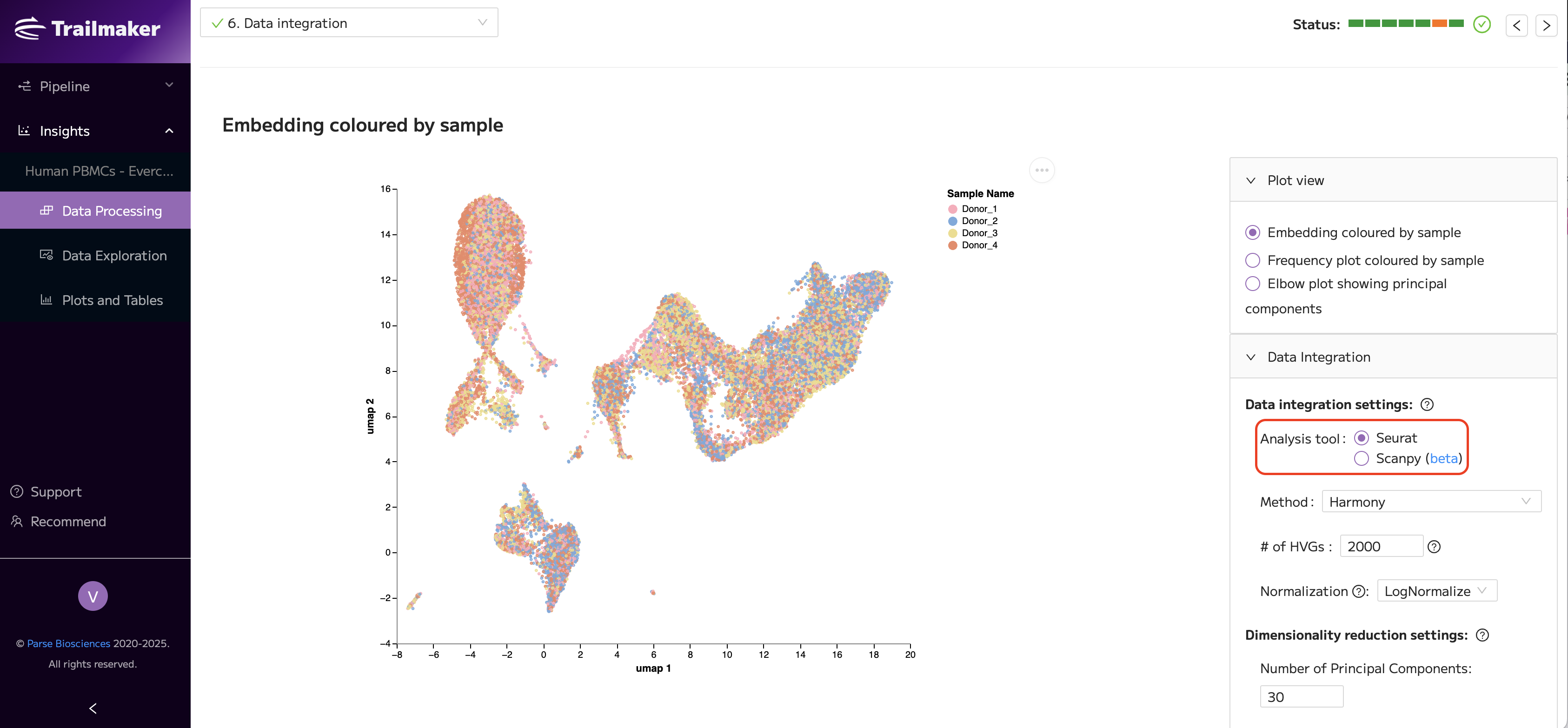
If you select Seurat, a Seurat object will be generated and utilized for all downstream analysis in Trailmaker. If you select Scanpy, an Anndata object will be generated and utilized for all downstream analysis in Trailmaker. For immune (TCR or BCR) projects, only the Scanpy option is available, with use of MuData (plus Anndata in the case of paired WT+immune) objects on the backend for downstream analysis. Your selection also dictates which type of object is available to download from the Insights Project Details page.
The integration methods available are as follows:
- In Seurat, three data integration methods are available – Harmony, Fast MNN, and Seurat v4. You can also select ‘No integration’.
- In Scanpy, only the Harmony integration method is currently available. You can also select ‘No integration’.
Harmony is selected as default. However, you can select the integration method and set the controls based on your requirements.
RPCA vs CCA (Seurat v4 only): When using Seurat v4 for data integration, anchors are identified using a dimensionality reduction approach. Two methods are available: RPCA (Reciprocal PCA) and CCA (Canonical Correlation Analysis).
- RPCA is selected by default. This method projects each dataset into the PCA space of the other datasets and is designed to be robust to noise and outliers. RPCA provides a more conservative integration, where cells in different biological states are less likely to be incorrectly aligned.
- CCA identifies shared patterns of variation across datasets by finding correlated gene expression structures. This approach can improve alignment when datasets share similar cell types and biological signals.
Normalization is applied to each sample before integration. There are several methods to achieve normalization; the default method in Trailmaker is LogNormalize. The SCTransform method of normalization claims to recover sharper biological distinction compared to log-normalization. SCTransform can only be applied when the integration method is set to Seurat v4. SCTransform applies additional filtering of genes that is more strict than using the LogNormalize method. For example, when using SCTransform, only the genes that are expressed in at least 5 cells are retained, and further genes may be filtered out based on their variance. These filters are applied internally using the sctransform::vst function, which Seurat calls under the hood. As a result, the number of genes that are shown in the Gene list in the Data Exploration page may be lower than the total number of genes originally detected in your dataset. Further information on SCTransform is available here.
Dimensionality reduction reduces the complexity of the dataset while preserving variation. In essence, dimensionality reduction “compresses” the data to enable visualization in 2 dimensions. There are many methods of dimensionality reduction, but one of the most popular in the field is Principal Component Analysis (PCA). This method introduces principal components (PCs) - a linear combination of variables in the data that better explain variations. The largest variance is accounted for by the first PC, the second largest variance by the second PC, and so on.
PCA is great for high dimensional data, but it is not optimized to generate 2-dimensional embedding. In practice, PCA is used to reduce the raw data into a lower dimension, acting as a pre-processing step. The resulting data is fed into other dimensional reduction algorithms, such as UMAP or t-SNE, to reduce the data into 2 dimensions.
Normalization can be biased by certain gene categories, such as ribosomal, mitochondrial and cell cycle genes. In the data integration step, these three gene categories can be excluded from the analysis if you are working with human or mouse data. For example, cell cycle genes should be removed if sampling timepoints occurred throughout the day. Those genes can otherwise introduce within-cell-type heterogeneity that can obscure the differences in expression between cell types. To mitigate this, the following gene sets can be excluded from the analysis of human and mouse species under ‘Dimensionality reduction settings’.
- Ribosomal genes are excluded based on the selection of genes that contain “rps”, “rpl”, “mrps” or “mrpl”, as well as the following three specific genes: FAU, UBA52 and DAP3. If this gene nomenclature is not true for your species, this feature will not work and should not be used.
- Mitochondrial genes are excluded based on the selection of genes that start with "mt-" or "MT-" (case insensitive). If this gene nomenclature is not true for your species, this feature will not work and should not be used.
- Cell cycle genes can be excluded from human and mouse datasets only. Trailmaker uses the list of cell cycle genes reported in the following article: Tirosh et al. “
Dissecting the multicellular ecosystem of metastatic melanoma by single-cell RNA-seq. ” Science (New York, N.Y.) vol. 352,6282 (2016): 189-96. doi:10.1126/science.aad0501. If you are using a species other than human or mouse, this feature will not work and should not be used.
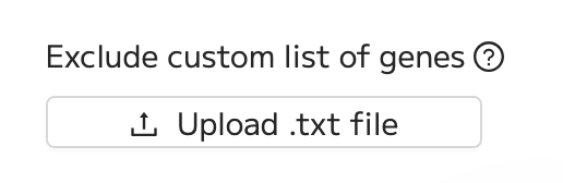
There's also the option to exclude a custom list of genes from the analysis: to do this, upload a text file (.txt) containing one gene per line.
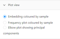
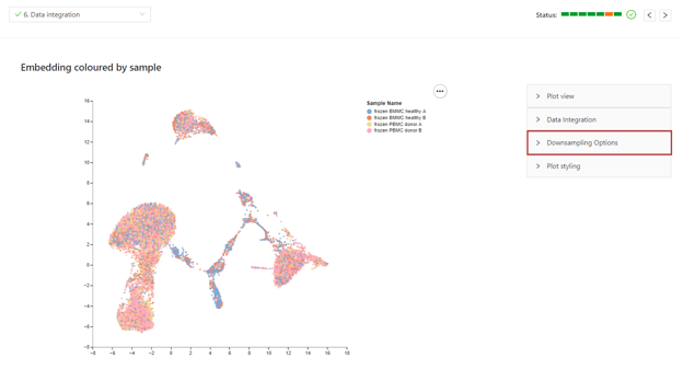
There are 3 plot views available in the data integration step. To change the plot type, select the desired plot under the plot view menu.
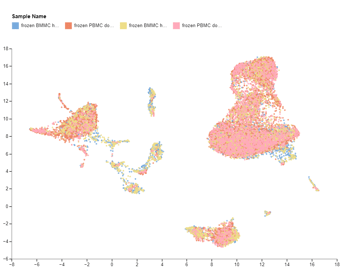
The first plot is a preview of the embedding generated after the dimensional reduction. This plot is only available for multi-sample datasets, and is not available in projects with only one sample.
The second plot is a frequency plot which shows the contribution of each sample to each cluster. This plot is also only available in projects with multiple samples.
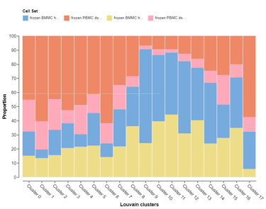
These first two plot views allow you to assess the quality of the integration of multi-sample datasets. Well integrated datasets will display good distribution of each sample across all clusters.
The third plot is an elbow plot which maps the percentage contribution of each Principal Component (PC) to the total variation in the dataset. Trailmaker determines the default number of PCs using the elbow method (described below). The resulting value is then floored at 30 PCs (a literature-median PC count across scRNA-seq studies) and capped at the number of PCs actually computed. If no clear elbow is detected, Trailmaker uses the maximum number of computed PCs (50).
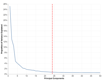
Note that the reported percentage of variation explained may appear lower than what you may have seen with Seurat-based workflows. This is expected, and applies to both Scanpy and Seurat projects in Trailmaker, as we use the Scanpy approach consistently across all pipelines for variance calculation.
Scanpy (which uses scikit-learn under the hood) calculates the proportion of variance explained relative to the total variance in the input data (not just the selected PCs), which is typically the variance of the top selected highly variable genes. Seurat's native workflows, by contrast, often report the proportion of variance explained relative to the total variance captured by the selected PCs themselves, which makes those values appear higher. Trailmaker uses the Scanpy approach across both Scanpy and Seurat projects: for Seurat projects, each PC's variance explained is computed as its eigenvalue divided by the total variance of the full input matrix, matching scikit-learn's convention. Therefore, the per-PC percentages reported here will be lower than you may expect from prior Seurat experience, even when the underlying PCA is capturing the same structure in the data.
To determine the initial number of PCs to use for downstream analysis, we apply the elbow method, which identifies the point at which adding more PCs yields diminishing returns in explained variance. For Scanpy projects, this is done using KneeLocator from the kneed library; for Seurat projects, we use findElbowPoint from the PCAtools package. For further reference on variance explained, see the scikit-learn PCA documentation, particularly the explanation of the n_components parameter and the explained_variance_ratio_ output.
Downsampling
Large datasets (e.g. >100,000 cells) can be downsampled specifically for the integration step. This speeds up the time it takes to integrate large datasets using some methods (especially Seurat_v4 and FastMNN) and enables very large datasets to be processed successfully. Once the data are integrated, the full data are available for downstream analysis and visualization.
Geometric sketching finds random subsamples of a dataset that preserve the underlying geometry, which is described in this paper: Geometric sketching compactly summarizes the single-cell transcriptomic landscape. In short, geometric sketching divides the transcriptional space into variable-sized hypercubes and then randomly samples the same amount of cells from each of the cubes; the resulting sketches preserve the data structure and put more emphasis on small and underrepresented cell types, leading to improvements even over using the whole dataset.
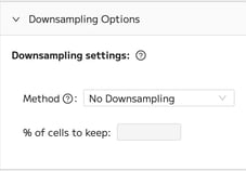
You can downsample your data under Downsampling Options.
Then change the Method to Geometric sketching. If you wish, you can also change the percentage of cells to keep.
Step 7: Configure embedding
In the last step of the Data Processing module, integrated data is further reduced into a 2-dimensional embedding. An embedding is a space which allows for the translation of data of a high dimension into a low dimensional space. High dimensional data represents a data set where the number of features is higher than the number of samples. The low dimensional space should represent the meaningful properties of the high dimensional data.
Trailmaker provides two methods to visualize embedding: UMAP and tSNE. UMAP is a more recent technique with an algorithm that is more readily adjustable to parallelization and works faster than tSNE. Hence, UMAP scales better for large datasets compared to tSNE. Generally, it is recommended to use UMAP embedding to visualize your data.
After creating the embedding, the embedded data points are clustered and colored according to those cluster annotations. Clustering is the process of grouping cells of high similarity. There are several clustering methods available, but the most used are Louvain and Leiden methods. Trailmaker uses the Leiden clustering method by default. Clusters are color-coded and numbered numerically so they can be identified and explored in downstream analysis in Trailmaker.
The clustering result can be modified by adjusting the clustering resolution in the clustering settings menu in step 7 of the Data Processing tab within the Insights module. The desired clustering resolution will depend on your sample preparation and research question. The embedding and clustering results that are produced in this step propagate the Data Exploration and Plots & Tables modules of Trailmaker.
There are two plot views available in step 7 where the embedding and clustering settings are configured, as well as multiple metrics that can be viewed on the plots. To change the type of the embedding plot, select the desired plot under the plot view menu.
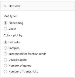
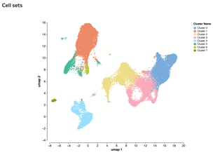
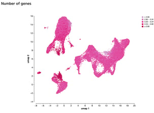
Selecting ‘Embedding’ shows a UMAP embedding by default, showing cells from all samples clustered and colored according to the Leiden clustering algorithm. The plot view can be changed to any of the options in the ‘Colour plot by’ menu, such as Number of genes.
This plot can be useful for identifying clusters or areas in the embedding plot that have particularly high or low metrics. For example, if high mitochondrial content is concentrated in one cluster, this would suggest that there is a population of dead cells that is clustered together. In this case, we recommend returning to the mitochondrial content filter (step 3) and reduce the threshold of the percentage of mitochondrial reads to try to remove the cluster.
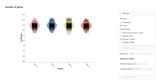
Selecting ‘Violin’ switches the plot to a violin plot. This plot is particularly useful for visualizing the quality control metrics, such as number of genes, across the samples in your dataset:
Data Processing for immune repertoire analysis
Paired WT+immune projects
The Data Processing page is enabled for paired WT and immune (WT+TCR or WT+BCR) projects.
Within Data Processing steps 1-5, the WT data are filtered according to the default or user-selected filtering thresholds. After WT data filtering is complete (at the end of step 5), the immune data are filtered to match the barcodes present in the WT data. This immune filtering step is not visible on the user interface. Any failures of Data Processing at the immune filtering step will appear on the user interface as a failure in step 6 (Data integration) or step 7 (Configure embedding). In this case, reach out to support@parsebiosciences.com for help.
The functionality of Step 6: Data integration and Step 7: Configure embedding is unaffected by the inclusion of immune data. Note that Scanpy is the default and only option for immune repertoire analysis in Trailmaker.
At the end of Data Processing, paired WT+immune projects contain a MuData object with matched WT+immune data, for downstream analysis and visualization in Data Exploration and Plots & Tables pages.
Immune only projects
Insights Projects that contain immune only (TCR or BCR) data without a WT parent contain the filtered count matrices that are output from Trailmaker’s Pipeline module. No further filtering is performed on the immune data within the Insights module, and the Data Processing page is disabled.
Adjusting a data processing setting
The default settings for each data processing step can be overridden using the ‘manual’ button in the Filtering Settings menu that is available within each step. For filtering steps 1-5, the setting can be altered for one specific sample or the adjusted setting can be applied to all samples using the ‘Copy to all samples’ button.
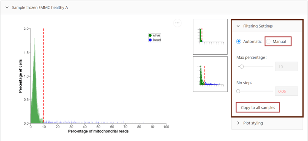
Specific filtering steps (steps 1-5) can be disabled using the ‘Disable’ button at the top of the filter. Using this button will switch off the selected filter so that no cells are filtered out at this step, and all cells are taken forward to the next step of data processing.

When a data processing setting is adjusted or a filter is disabled or enabled, you will be prompted to re-run Data Processing. You can elect to ‘Run’ data processing or ‘Discard’ the changes. When the re-run is initiated, only the steps that have adjusted settings will be re-run. Note that re-running Data Processing is likely to take several minutes, with the exact time dependent on the size of your dataset.

Data Processing failures
It’s important to note that the data processing steps may fail for a variety of reasons. One major reason for data processing failures is if there is not enough data to be processed. Data Processing steps 1-5 can fail if the number of cells is very low, and the data integration step (step 6) can fail if the number of cells is lower than 100.
Guidance on how to troubleshooting and resolve data processing failures is available in the following article: How to adjust data processing settings to fit your dataset and troubleshoot data processing failures.
Briefly, there are several ways that you can address data processing failures:
- Reduce the number of cells being filtered out: You can alter the filtering settings in steps 1-5 (e.g. by lowering thresholds) or disable specific filters to reduce the number of cells that are filtered out which will, therefore, increase the number of cells proceeding to downstream processing and analysis. However, this can lead to poor quality cells being included in the downstream analysis.
- Elect to use no integration: You can select ‘No integration’ in the data integration settings in step 6. However, selecting this option may result in suboptimal analysis due to batch effects that have not been removed from the analysis. If you choose to select ‘No integration’ we recommend that integration quality is checked using the embedding and frequency plots in step 6.
- Exclude the sample(s) with too few cells: It is possible to exclude the problem sample(s) that has too few cells. This can be done in the existing project by setting a high threshold in one of the filtering steps in order to filter out 100% of the cells in that sample. Alternatively, you could delete the problem sample(s) in the Insights module Project Details page in the existing project or create a new project and upload only the other samples, excluding the sample(s) with few cells.
If data processing fails for your project and cannot be resolved by following the guidance in this support article, contact us at support@parsebiosciences.com.
Saving a processed project
Whilst the project is being processed, you can leave the screen, log out of Trailmaker and close your web browser without affecting the processing - Data Processing will continue to run. You can elect to receive an email confirmation when your Data Processing completes using the ‘Receive email notifications’ toggle button when you first process a project.
The processed project is saved automatically by Trailmaker. When you log out and then return to the platform, you can immediately view the processed Insights project.
Exporting the data processing plots
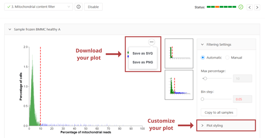
All plots that are available in the data processing module can be fully customized using the ‘Plot styling’ menu. You may want to consider including these quality control plots in your manuscript as evidence of sample quality.
To download a plot from the data processing module, select the ‘...’ menu on the top right of the plot. Download options include SVG (high resolution) and PNG (lower resolution).
Downloading the data processing settings
All data processing settings can be downloaded as a text file (.txt) using the ‘Download’ button in the Project Details page of the Insights module.
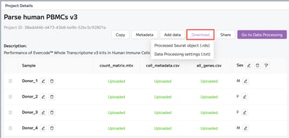
We recommend that you report these data processing settings (filtering thresholds, integration method, etc.) in your manuscripts. We can assist with writing this paragraph, if needed - contact us at support@parsebiosciences.com.
Summary of Insights Data Processing tab
The Data Processing tab within the Insights module of Trailmaker filters out background, dead cells, doublets and low-quality cells, removes batch effects and reduces the dimensionality of the data. Data processing is an essential prerequisite for downstream data analysis and visualization.