
Differential expression
Volcano Plot
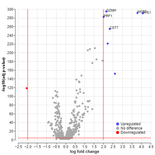
A volcano plot is a type of scatter plot that represents the differential expression of genes. This plot allows you to identify possible biologically significant genes. The x-axis represents the log fold change, and the y-axis represents the negative log10 of the adjusted p-value.
If you performed differential expression analysis in the Data Exploration module, your most recent selections for the analysis would be reflected in the Volcano plot controls menu. You only need to click compute if you want to plot a volcano plot with the selection from Data Exploration!
Compare cell sets within a sample/group
Here, you can perform differential expression analysis to find marker genes that distinguish one cluster from another cluster or from all other clusters and plot a volcano plot that represents these genes. The calculation uses the presto implementation of the Wilcoxon rank sum test and auROC analysis. For more information, see the presto vignette.
To perform the differential expression analysis and plot the volcano plot go to the Differential expression control. Choose a cell set you want to compare in the first drop-down menu. (1). Choose another cell set, the option ‘Rest of Louvain clusters’ or ‘All other cells’ in the second drop-down menu (2). [Note that in the case of Louvain clusters, ‘Rest of Louvain clusters’ and ‘All other cells’ is the same because all cells are assigned to a Louvain cluster. Whereas for Custom cell sets, these two options will be different if not all cells in the dataset are assigned to a Custom cell set.]
Lastly, select the sample/group within which you want to compare cell sets or choose the option ‘All’ (3). Then click compute.
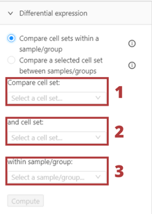
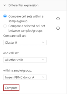
The volcano plot based on the computed differential expression analysis will appear in the plot tile.
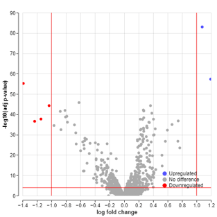
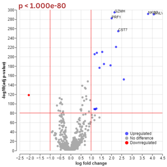
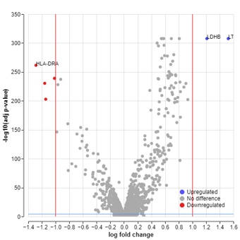
The most upregulated genes in the plot are toward the right (in blue), while the most downregulated genes are toward the left (in red). Other genes with a small magnitude of change are colored in gray. The most statistically significant genes are toward the top of the plot.
You can also export the results of the differential expression analysis in a CSV format. Read more in the Export to CSV section.
Compare a selected cell set between samples/groups
With this differential expression analysis, you can find differentially expressed genes between two experimental groups and plot the respective volcano plot. This analysis uses a pseudobulk limma-voom workflow.
To perform this differential expression analysis and plot the volcano plot go to the Differential expression control. Then choose a cell set you want to compare in the first drop-down menu (1). Choose the first sample/group to compare in the second drop-down menu (2). Lastly, select the second sample/group you want to compare with the first sample/group or choose the option ‘Rest of Samples’ or ‘All other cells’ (3).
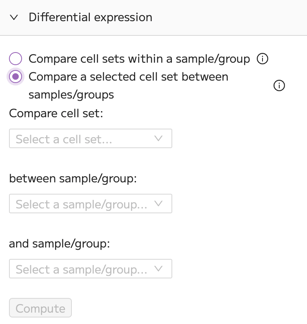
When you have made your selections, click compute.
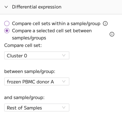
The volcano plot based on the computed differential expression analysis will appear in the plot tile.
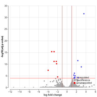
The most upregulated genes in the plot are toward the right (in blue), while the most downregulated genes are toward the left (in red). Other genes with a small magnitude of change are colored in gray. The most statistically significant genes are toward the top of the plot.
You can also export the results of the differential expression analysis in a CSV format. Read more in the Export to CSV section.
Data thresholding
Under the Data thresholding control, you can modify the significance thresholds and the design of the guidelines.
Note that in some cases you may observe horizontal bands of points in the volcano plot, where many genes share the same y-axis value (−log10 adjusted p-value). This behavior is expected and not an error.
Trailmaker reports adjusted p-values using the Benjamini–Hochberg procedure, which is a method that enforces monotonicity of adjusted p-values across all tested genes. Many distinct raw p-values can collapse to the same adjusted p-value, resulting in horizontal banding in the plot.
In such cases, volcano plots based on adjusted p-values can become visually uninformative, even though the underlying differential expression results are valid. For exploratory visualization, users may find it helpful to export Seurat/AnnData object or the differential expression results (csv) and generate a custom volcano plot using raw p-values (e.g. log fold change vs −log10 p-value), while still relying on adjusted p-values to assess statistical significance.
This behavior is a known property of multiple-testing correction and does not indicate rounding, loss of precision, or a processing issue in Trailmaker.
Significance Thresholds
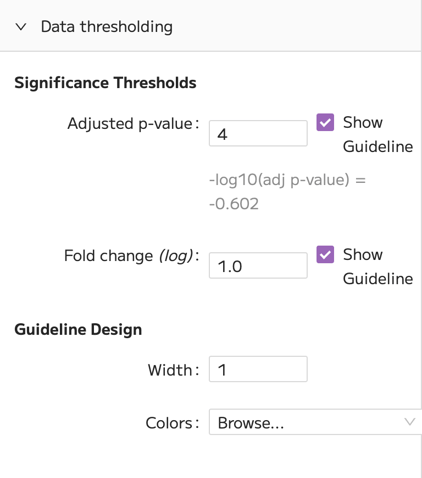
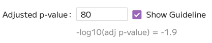
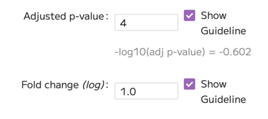
You can change the -log10 (p-value) threshold on the y-axis. To do this, input a new threshold into the input box. This can change which genes are going to be considered upregulated or downregulated. The equivalent p-value is displayed below the input box. See the example below.

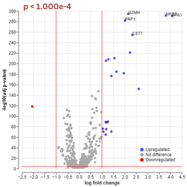
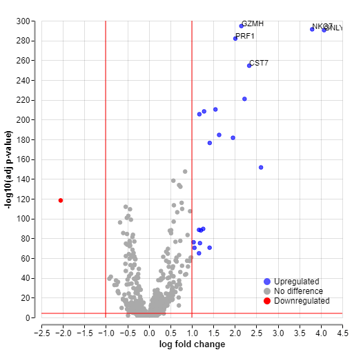
You can also change the fold change (log) value on the x-axis. The fold change is the ratio of gene expression between the two groups being compared. They are then log-transformed. Adjusting the log fold change value threshold can change which genes will be considered upregulated or downregulated. The new value will be represented as the negative and positive log fold change thresholds, as shown in the example below.
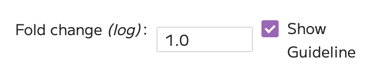

You can also choose to deselect the option ‘Show guideline.’
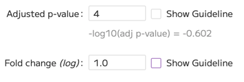
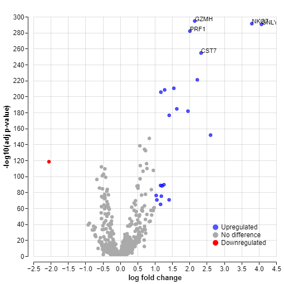
For both thresholds, deselecting this option will color the guideline black instead of the default red in the plot tile. When you download the plot, the guidelines will disappear completely. See the example below.
Guideline design
Under the guideline design, you can adjust the width and color of the guidelines.
To change the width of the lines, just input the new width value.
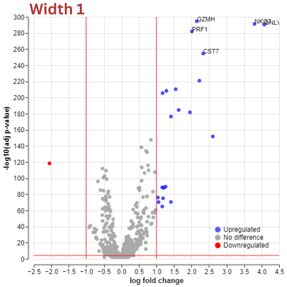
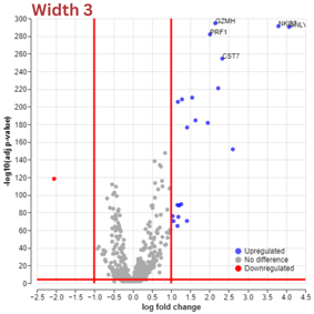
You can also change the colors of the guidelines. To do so click on Browse next to “Colors”. Then click on the colored circle on the right of the guideline whose color you want to change.
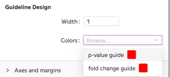
Then simply select a new color. The change is going to be applied automatically.
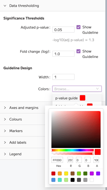
Colors
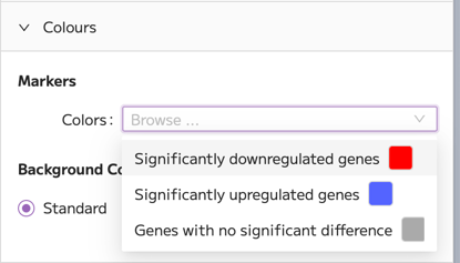
Besides color inversion, under the “Colors” control you are able to change the appearance of markers. Click on Browse next to “Markers”. To change the color of gene markers, click on the colored circle on the right of the marker type.
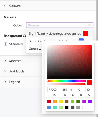
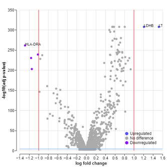
Then choose a new color. The change is going to be applied automatically.
Comparing fewer than 3 samples
Note that for some selections, an error message will appear:
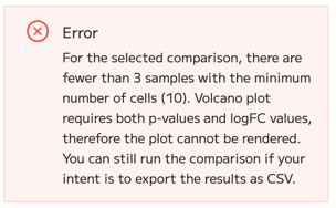
The message explains that there are fewer than 3 samples with the minimum number of cells required to perform the differential expression calculation in your selected comparison. The most likely explanation is that you are comparing 1 sample to 1 other sample. An alternative explanation is that you are comparing 3 or more samples but that there are too few cells (<10) in one or more of the comparison groups, resulting in only 2 ‘valid’ comparison groups that contain enough cells to perform the calculation.
As the error message explains, for a comparison between only two ‘valid’ samples it is not possible to compute the differential expression and obtain statistically meaningful results. For such a comparison it is therefore not possible to create a volcano plot in Trailmaker.
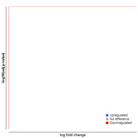
In this case, you can still perform the differential expression calculation, but the results will only consist of DE genes and logFC values and should be interpreted with caution and only used for exploratory purposes. No adjusted p-value will be calculated, which means that you will not be able to plot a volcano plot. The plot will look like the image below. However, you can download your results in a CSV format.
Export to CSV
When you have performed the differential expression analysis, alongside the volcano plot an ‘Export to CSV’ button is going to appear at the top of the plot window.
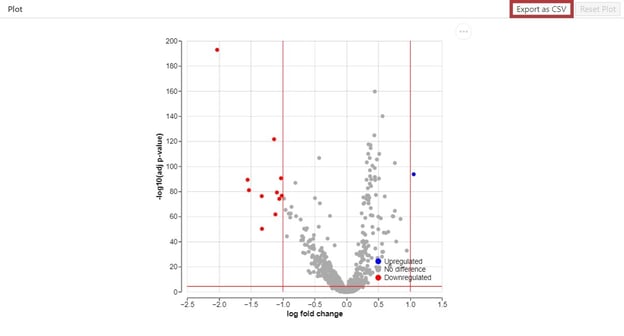
Click on the button, and your differential expression results will be automatically downloaded in a CSV file.
Batch Differential Expression Table
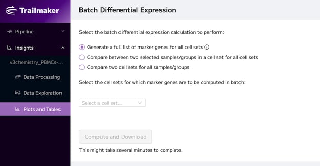
Here you can perform DE analysis and download batch DE tables. There are three comparison options.
Generate a full list of marker genes for all cell sets
First, you can download a full list of marker genes for all cell sets, where each cell set will be compared to all other cells, using all samples. You can select which cell sets you want to use for analysis.
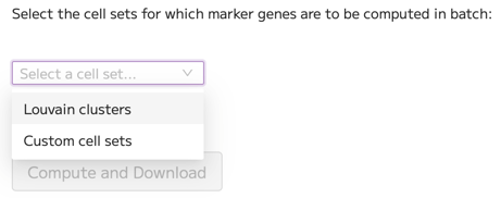
When you have selected the cell sets for which marker genes are to be computed in batch, click “Compute and Download”.
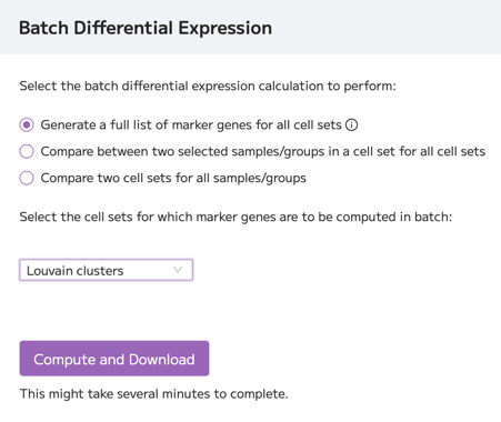
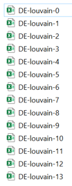
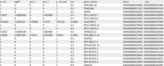
A DE table will be created for each cell set.
Compare two selected samples/groups within a cell set for all cell sets
You can also compare two selected samples/groups within a cell set in a batch for all cell sets.
Choose a sample/group you want to compare in the first drop-down menu. (1). Choose another sample/group, or the option ‘Rest of Samples’ or ‘All other cells’ in the second drop-down menu (2). Lastly, select the cell sets within which you want to compare samples/groups (3).
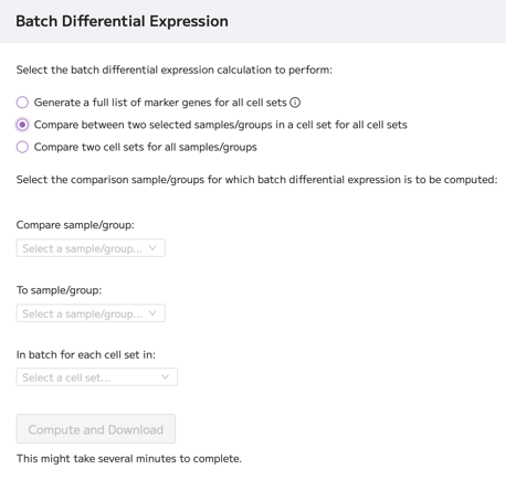
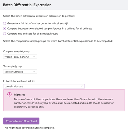
Then click “Compute and Download”. Note that a warning may appear.
Compare between two cell sets for all samples/groups
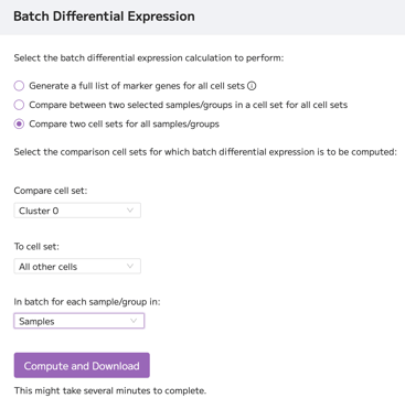
And lastly, you compare two cell sets for all samples/groups.
Choose a cell set you want to compare in the first drop-down menu. (1). Choose another cell set, or the option ‘Rest of Louvain clusters’ or ‘All other cells’ in the second drop-down menu (2). Lastly, select the sample/group for which you want to batch compare cell sets (3).
Then click “Compute and Download”. Note that you might get a warning message, depending on the selection you made.
The message explains that there are fewer than 3 samples with the minimum number of cells required to perform the differential expression calculation in your selected comparison. The most likely explanation is that you are comparing 1 sample to 1 other sample. An alternative explanation is that you are comparing 3 or more samples but that there are too few cells (<10) in one or more of the comparison groups, resulting in only 2 ‘valid’ comparison groups that contain enough cells to perform the calculation.
As the warning message explains, for a comparison between only two ‘valid’ samples it is not possible to compute the differential expression and obtain statistically meaningful results. For such a comparison it is therefore not possible to create a volcano plot in Trailmaker.
In this case, you can still perform the differential expression calculation, but the results will only consist of DE genes and logFC values and should be interpreted with caution and only used for exploratory purposes. No adjusted p-value will be calculated.
Where the downloaded file contains "AveExpr" column, this value represents the average log2 expression (log2‑CPM) of each gene within the selected cell set (if selected) and across all samples in the dataset. Note that this value is not dependent on the samples or groups selected for comparison.
Plots & Tables for immune repertoire analysis
The plots available in the Plots and Tables page depend on the data type your project contains. For immune profiling projects (TCR or BCR data with or without a WT parent), there are 3 additional plots at the bottom of the Plots and Tables homepage view, in a section entitled “TCR analysis” or “BCR analysis”.
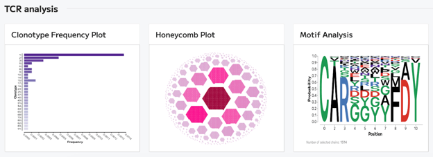
Clonotype Frequency Plot
The clonotype frequency plot displays a bar chart of the most abundant clonotypes in the dataset.
By default, the plot shows the top 10 identified clonotypes in the dataset.
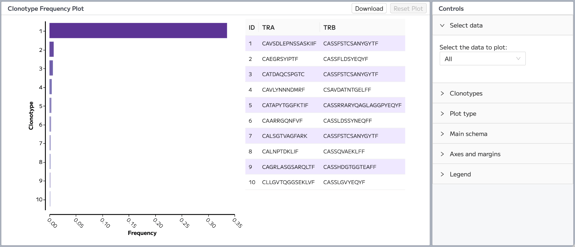
In the ‘Select data’ menu, individual samples or metadata groups can be selected. In this case, the clonotype frequency is recalculated according to the selection and the clonotypes are reordered such that the plot (and associated legend) displays clonotypes in descending order of frequency.
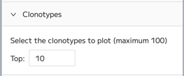
In the ‘Clonotypes’ menu, you can select the number of top clonotypes to plot. The default is 10. The maximum is 100.
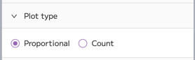
In the ‘Plot type’ menu, the plot view can be changed from showing ‘Proportional’ where the x-axis displays Frequency, to ‘Count’ where the x-axis displays the count of cells.
Other plot control menus behave in the same way as other plots in the Plots and Tables page, as described in the Plots and Tables: General Options section.
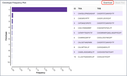
Downloading the Clonotype Frequency Plot results in the download of 2 files: an image file (.png file) of the frequency bar chart and a table (.csv file) of the legend.
Honeycomb Plot
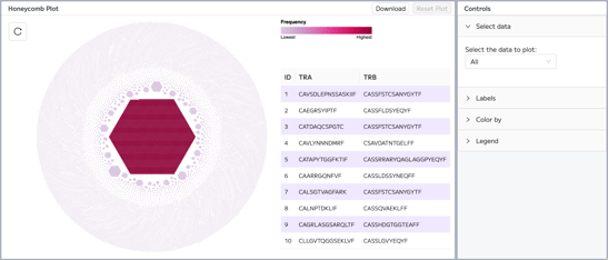
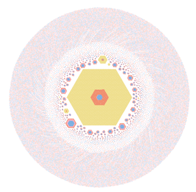
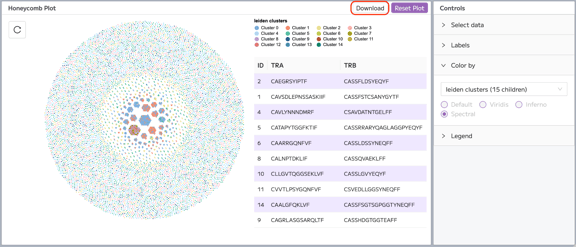
The honeycomb plot displays groupings of cells by clonotype, with the most abundant clonotype cluster plotted in the centre of the plot. By default, the plot displays all cells in the dataset with an identified clonotype. By default, the plot is colored by clonotype frequency.
In the ‘Select data’ menu, individual samples or metadata groups can be selected to view on the plot. The default selection is ‘All’, which shows all cells with an identified clonotype.
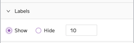
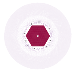
In the ‘Labels’ menu, the clonotype cluster labels can be shown or hidden, and the number of top clonotypes to be labelled can be selected. The default is that labels are hidden.
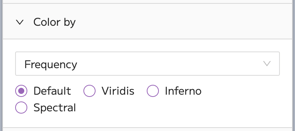
The selection in the ‘Color by’ menu dictates the plot coloring. The default selection is frequency, with the default colorscheme. When Frequency is selected, the Viridis, Inferno and Spectral colorschemes are available. Using the dropdown menu, the plot can be colored by cell set families, such as Leiden (or Louvain), samples, metadata groups, custom cell sets, or custom clonotype cell sets. Note that the color selections for cell set families is determined in the Data Exploration page, within the Cell sets and Metadata tile.
Example of Honeycomb plot colored by sample using the ‘Color by’ menu:
Other plot control menus behave in the same way as other plots in the Plots and Tables page, as described in the Plots and Tables: General Options section.
Downloading the Clonotype Frequency Plot results in the download of 2 files: an image file (.png file) of the honeycomb plot and a table (.csv file) of the legend.
Motif Analysis
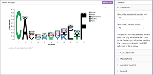
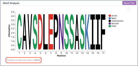
Motif analysis displays the composition of the selected CDR3 chain in your data. Motif analysis is performed using the logoplot_cdr3_motif function in Scirpy - more details can be found on the Scirpy tutorial.
- The letters represent the amino acids at each position in the chain sequence.
- The colors represent the properties of the amino acids, as defined by the chemistry parameter in the python logoplot function.
By default, the plot shows all CDR3 amino acid sequences of the specified chain and length (see ‘CDR3 selection’ menu below) for all samples and all cell sets.
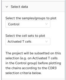
The first dropdown menu in the ‘Select data’ menu allows users to select the samples/groups to plot. The second dropdown menu allows users to select the cell sets to plot. The project will be subsetted on these selections (e.g. on Activated T cells in the Control group) before plotting the chains according to the CDR3 selection criteria in the ‘CDR3 selection’ menu.
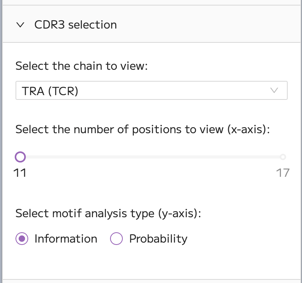
The ‘CDR3 selection’ menu dictates the chain, chain length and format of the data to be plotted:
- The dropdown menu dictates the chain that is plotted. Options for TCR data are TRA or TRB, with TRA as the default. Options for BCR data are IGK/L and IGH, with IGK/L as the default.
- The slider allows the user to select the number of positions to view, which dictates the x-axis of the plot. The range is 11-17. The default is 11.
- The plot options are Information (default) and Probability which dictates the y-axis of the plot. High Information in a given position means that that position is dominated by one (or a few) amino acids. This will result in one (or a few) amino acid letters being displayed at that position, taking up the majority of the y-axis. Low information shows that amino acids are more variable at that position. Probability shows the proportion of identified amino acids at each position.
The number of chains included in the plot is displayed below the plot.
Note that chains containing * symbols are filtered out in motif analysis in Trailmaker. This is because the * symbol represents a stop codon, which indicates that the receptor sequence is unproductive or truncated and doesn’t encode a full functional protein. Including such sequences in motif calculations can distort amino acid frequency estimates and introduce noise into the resulting motif plot. By filtering out chains containing stop codons, Trailmaker ensures that motif analysis is performed only on valid CDR3 sequences, producing clearer and more biologically meaningful results.
Other plot control menus behave in the same way as other plots in the Plots and Tables page, as described in the Plots and Tables: General Options section.
Plot restrictions for Immune only Projects
The Plots and Tables module for immune only projects (TCR or BCR data without a WT parent) display only the 3 immune plots: Clonotype Frequency Plot, Honeycomb Plot and Motif Analysis.
Some plot customization options, including the Select data menu and the Color by menu are restricted due to the lack of cell sets (such as Leiden clusters) in immune only data.
Downloading plots
You can download all plots available within the Plots and Tables module by clicking on the button with three dots in the top right corner of the plot. The example below shows how to download the UMAP from the Categorical embedding:
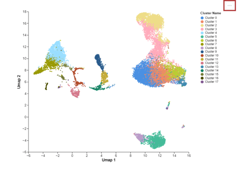
You can save your plots as PNG or SVG. The SVG option is typically higher resolution than the PNG option. Click on your preferred option to start the download.

You can also download your plot using right-click “Save image as.”